expressionism

Art, Nature & Soul #59

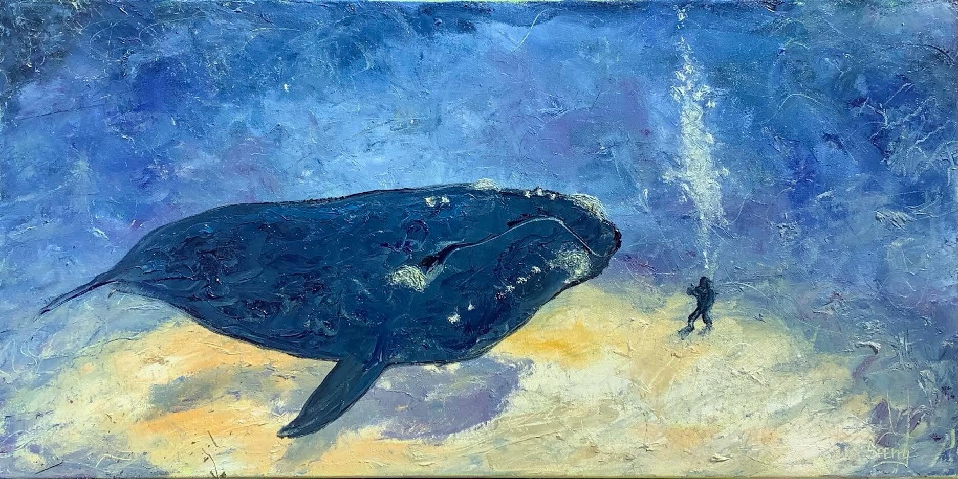
The deep blue sea, the darkness of an undersea world, as illuminated by the flickering light from above. A place where representational meets abstract in the recesses of the mind. As a young boy I loved to swim and especially underwater.

Growing up, I learned to swim at the YMCA, then we had a pool in our backyard. I’d spend hours swimming, doing circles and swimming back and forth across he middle underwater. In boy scout camp, I remember one camping trip in particular spent tenting, canoeing and swimming. Once I had swam out pretty far into the lake and decided to dive deep as I could. I was pretty good at holding my breath, so after one deep breath I dove to the bottom of the lake, some 15-20 feet or so, opened my eyes and magic, that was it. The water was green, the light flickered from above and I could see the plants, slimed with algae and fish swimming by me close. I was amazed, tickled & wanted to stay down there forever. Thinking back It was my, obscure reference #1, Incredible Mr. Limpit moment. A story about a man who loves the sea so much he dreams of being a fish and then is one. Flipper, Voyage to the Bottom of the Sea & Jacques Cousteau, obscure reference #2, were all favorite TV shows, I’d watch regularly in awe in deep fascination. I had even thought of being a n Oceanographer in middle school, then swimming with and photographing the ocean seas creatures in my teens and early 20s.

At 57, I’ve finally booked a charter to go snorkeling for the first time. Our road trip included a 4 day stop in Key West, Florida, so I found a charter that left off of Stock Island in Key West. It was a Wild About Dolphins excursions. We choose the 3.5 hour trip. Tara, our guide was fantastic, as the pups came along for the boat ride and she watched after them so we could snorkel. After watching a couple pods of Dolphins, one that had a baby swimming with them, we headed for Casa Rocks, 2-3 ,miles off the island shore. Don, my husband, & I went in together, after testing the water to see if we needed wet suits or not. The water was about 75 degrees so we opted to swim without, although they would have made us more buoyant & offered some protection from the sea critters. Tara gave excellent instructions as she passed us the flippers, mask & snorkel. After getting in the water, I realized I hadn’t swam in over a decide and its a lot of work, so we went back for noodles, a float assist, so we could focus on getting used to the flippers , mask and snorkel…& breath through your mouth, not your nose…ha. I swam over the reef, repeatedly made that mental note and stuck my face in the water.

Wow, so amazing, a great variety of & hundreds and hundreds of sea critters, all living together. There were so many different types and some in large schools, it was hard to keep track of all that I was looking at. That said, the ones that stood out were several Yellow Tangs, a large Parrot Fish, what I think was a Spider Crab & a Moon Jellyfish, that I made sure to keep mt distance from. It was thrilling to watch them all do there thing, in the community around the living coral reef, 3rd largest in the world. As I often do, I just kept thinking symbiotics, symbiotics. Most life either gets it or just lives it instinctively…then I think, humans? Try as we may, a large percent just doesn’t get it. In my way of thinking, all of life needs and relies on these relationships or survival, and the patterns made echo across all life. By definition though, its more directly related to, 2 species mutual dependency for survival, like anemone & a clown fish. Symbiosis is a close ecological relationship between the individuals of two (or more) different species. Sometimes a symbiotic relationship benefits both species, sometimes one species benefits at the other's expense, and in other cases neither species benefits, so ask which are you and be it.

I have watched & read a fair amount of non fiction & documentary on sea life, and in particular, endangered whales. This painting is based on an image from one such educational opp & experience, that I’ve translated into a painting, charged with my thoughts, emotions & favorite color…blue. Plus the thrill eagerly anticipated entrance of the whole undersea world’s life, in it's abundance & glory. Snorkeling was a great thrill that I intend to do again, until then, I paint the world I live in, as I see & experience it.

6 different blues, a green, violet, magenta, 3 yellows, white, on canvas using an arsenal of paint brushes, palette knives & other implements were all used in combinations to create this piece. As always, your comments & questions are welcome~ Richard Sperry

‘Caverns’ 24”x24” oil

Caverns 24"x24" oil

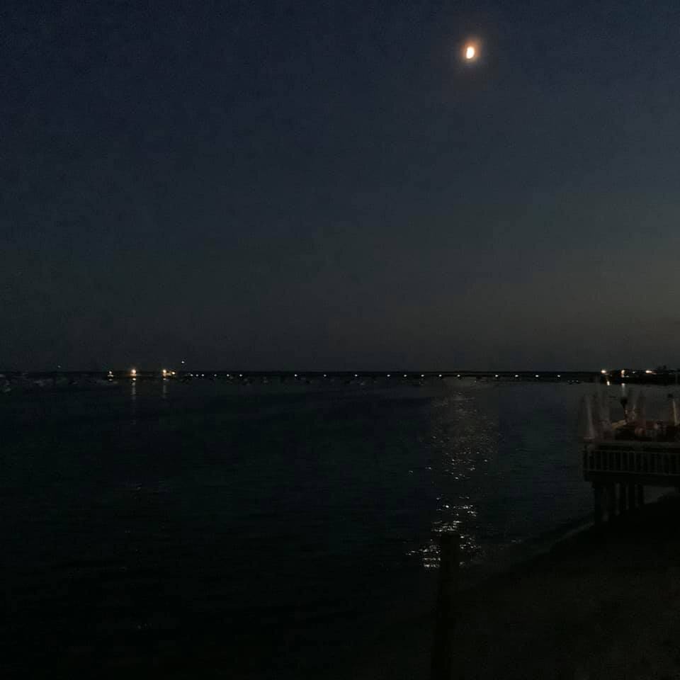
Me snorkeling for the first time, in Key West 2022..

Art, Nature & Soul #58

It was a happy 1st Day of Fall, September 22, 2021~ Just days earlier the Harvest Moon had appeared, September 19, 2021 from ferry leaving Martha's Vineyard. We had boarded the Steamship Authority Ferry leaving Martha’s Vineyard, after a beautiful day of exploring it for the first time. When we were about 2 miles out, as the sun began to set for the day. I had got out on deck to search for some photo opts. I had been thinking, sunset over the ocean, the vineyard, when low and behold, there it was, over my shoulder. It was Sunday the 109th and the Harvest Moon had begun to rise. Luckily I had my camera with me and captured a beautiful scene of the the moon rising near an edge of the Island, one which had homes & a lighthouse atop the bluff. When I got back home, it was the first painting I created on a large canvas. Here’s the thoughts, approach & results…enjoy.

We had got back home, a couple days later and look what happened when I woke up at 3am that morning. With a vivid visual memory of both the image & the experience, coupled with the my emotions & a photo reference, I set out to convey my excitement for the event. With a 30” square, drip & splatter toned canvas, my paint, brushes, palette knives, scratching tools, paper towels and a box of tissues, I began my translation.

Painting the painting and working quickly, my intuitive nature, took hold from the beginning. I tend to paint and build these landscape compositions, in the order it would have appeared in nature as created, sky, water, land, trees buildings…etc. I’ve felt when you build in this order it has a more authentic order that allows for a natural perspective, even in the most static perspectives, and then a sense depth is achieved. Plus, I have felt more than a bit dis-enchanted when I see the sky painted over the leaves of trees, in others work. It always looks forced, an obvious oversight and not thought out to me, hence making me more aware of it. Just a side note and observation.

Before long the painting was completed and the sun rose out my home window. As you can see, the photo reference is in fact only a reference point. I’m not doing an illustration, trying to duplicate or paint the photo, but create a whole new experience, based on my own. In other words bringing my own light and sunshine to everything I do, and hoping to bring some to you and your life too .

Your comments & questions are always welcome~ Richard

'Harvest Moon off Martha's Vineyard' 30"x30" oil

‘Harvest Moon off Martha's Vineyard' 30"x30" oil

Photo taken from the ferry leaving Marth’s Vineyard, Sunday September 19, 2021

Art, Nature & Soul #56

These days I spend most of my time painting, but there was a time when I used to spend my days drawing every chance I got. Painting and drawing are very different disciplines for me, one being about edge the other about line, although I sometimes merge both into a single concept in paint, scribbling & sgraffito.

Growing up, my fascination was people, trying to capture, not only their physical attributes, but their personalities, I loved to draw them & find those unique features that made them… them. Especially faces and noses, it seemed that noses were really those defining features for me. I guess you’d say I have a bit of a nose fetish…haha, but for reals. Whether they were drawn in charcoal, lead or ink, most of the time I’d challenge myself to either not erase or not lift up my drawing implement from the paper. It was a bit of a self-challenge to force myself to see form & shapes correctly. Though, I still tend toward exaggerations of a sort, from the slightest, to more caricature and cartoon.

There are hundreds and hundreds of sketches and drawings throughout my home & studio, books full of figures and ideas. I recently picked up a new drawing pad in an ongoing effort to force myself to make time to draw. I used to do lots of cross hatch & cross contour in ink. For years I’d do a 5-10 minute quick sketch, mostly more single line drawn cartoon and gestures. It’s so infrequent , less than 5% of my time, that I paint or draw figures anymore that I’ve got in the habit of drawing them out on the canvas first before painting them, just to be sure I have the proportions down the way I want them. That said, in the past year or two I set to do a self portrait in oil and was half way complete before I saw I had forgot to do my preliminary under drawing first. With the direction of my current work over the past decade or so has led me to do more scribbling, sgraffito & scratching. Here’s a recent scribbled figure I did earlier this year. I think I’ll have to do much more scribbling. I love the organic, free flowing & natural feel of it.

As always, your questions & comments are welcome~

Richard

Broke out my ebony pencil and did some scribbling.
‘Angelo’ 12”x12” pencil

Art, Nature & Soul #55

How we see is as important as what we see, when conveying our minds visual capture. Beyond the visual perception, I tend to tap into all my senses, all 7, Sight (Vision), Hearing (Auditory), Smell (Olfactory), Taste (Gustatory), Touch (Tactile), Vestibular (Movement), Proprioception (Body Position) and perhaps another the intuitive nature and third eye.

Sitting on the deck of the Aqua Bar in Provincetown, Ptown Massachusetts and looking out over the sea and sky, the moon rose and glistened off the water. I was taken by the subtle light and movement of the night. I broke out my camera to get a photo capture of what I was seeing, the sparkle of moonlight twinkling across the ocean. How could the light reflecting off the moon be bright enough to be cast upon the water, I questioned in my mind, but it was and did. It was about 75 degrees with a light breeze that moved the water and air around this night, the photo hardly captured it, which fascinated me. A distant pier, the McMillian Warf and several boats, had a few lights shining off them too, but it was 1/2 hour after sunset and the light seemed to fade to black when I began to search for the light.

There’s a multitude of color theories, but the one I’ve found most helpful is to find the light, seek the color and look for how they interact and reflect off each other, let the dance, play & mingle be what they are and see it. A wise artist, Hilda Neily, that I had pleasure of painting & studying with, once said to me, “it’s like dropping acid” once you get it, you see it and it can’t be undone. I’ve found that to be true, Even though, and perhaps more so here in the mid-west with more traditional color schemes. Most, I dare say see the sky as blue, the grass as green and dirt as brown. Now when I look for the color I first see the light. In my paintings I often juxtapose both my regular & new ways of seeing them in a single painting., such is the case here, not in blocks but layered & moving planes of color & texture. Edges more than line, it seems it’s all connected, not separated by line, the world around us, the things in it, all intersect, relate to and are more symbiotic than not, in the broadest sense as well as the minut.

One morning, while in Ptown it was raining. I broke out my easel, paint, some small panels and utensils for painting. I found a wonderful view from the second floor out the window, another outside on the deck, and yet another from the the photo and sensory memory of the moon, sky & water, while sitting on the deck experiencing it. Here’s the result, as I’m 57 years old, it took fifty-seven years of studying, growing, time ,money & passion to complete this one, now that’s an investment.

Your questions & comments are welcome, always,

Richard

Color Study #100, Moonbeams 12’x12’ oil on panel

Art, Nature & Soul #54

*The plight of the whales of the world are a cause near and dear to my heart. The many species along the eastern seaboard and particularly the North Atlantic Right Whale have a special place for me, as I've been following them from some of their feeding grounds, in Cape Cod, Massachusetts to their calving grounds around the St, Augustine, Florida, for nearly a decade now. If you've followed me for a while you know my meaning. After 2 recent documentary watches 'Entangled' and 'The Loneliest Whale', both excellent, I've decided to donate the total proceeds from the sale of this painting to Center of Coastal Studies Provincetown, as I've seen them in action numerous times and have even participated in an entangled whale rescue. Message me for further info on how to purchase this painting and help to 'Save the Whale', from extinction.

There are only about 400 or so North Atlantic Right Whales surviving along eastern seaboard of North America, their primary resident. Beyond the obvious of the previous 3 centuries Whaling Industry, we have known for quite some time the multiple factors infringing on their ability to thrive. It appears that the primary ones are, entanglement, ship strikes, & sonar disrupting their communications. The Fisheries have, for the most part been trying to cooperate as have the shipping lanes been modified to avoid them when we know when and where they are. Climate change has posed yet another challenge as the areas that we have been trying to protect are not always the places they are going now. With climate change has brought more random chaos and a change in where the abundance of food may or may not be. It seems there is a partial and highly effective solution. The majority of the whale deaths are due to entanglement. A team has created an experimental rope less traps, that if supplied to the fisheries could in fact help the fisheries as well as save the whale. Funding is needed to continue the development and distribute the new traps to the fisheries, free of charge contingent on the agreement of eliminating all roped cages.

For this piece I utilized a photo from one of the documentaries as my reference for the direct approach of painting and its expression. A relatively simple painting and yet beyond the image of the whale, the richness of the colors was extremely important to me in creating the depth of field. The colors used were bleached & unbleached Titanium white, 6 different blues, mineral violet, magenta, Indian yellow, raw sienna & yellow ochre. As I really enjoy varied textures, my primary tools are brushes, palette knives, sculpting tools & tissues. This assisted in creating the illusion of the whale being suspended in the water, paint before the scale of the diver.

Your questions & comments, as always are welcome.,

Richard


’Save the Whale’ 36”x18” oil

Art, Nature & Soul #53

Here’s 18 more mini-me’s that I painted this past spring 2021. It’s been an usually lush spring this year, so green is the word….lots and lots of green. Nature gives me great solace even in the most trying of times. Where I live, there are at least 5 parks/forest preserves & the river within an easy walk from my home, besides the pond directly behind it. I walk one of them daily, most of the others get a weekly or monthly visit, besides all the ones we drive to throughout the year, within an 4-8 mile radius and across the country, on our road trips. It’s a great place, If you like hiking, biking & boating and we do, besides the 5 town arts events and cultural arts, music, theater scene, is happening here along the river year round, from Aurora, Batavia, Geneva, St. Charles & Elgin Illinois, and with Chicago & Lake Michigan just down the road 34 miles. All these areas provide lots of opportunity to paint., balancing my art, nature & soul work and ambitions.

Each panel has a matter-of-factness conveyed of both the subject matter and my approach. There’s no over thinking it or agonizing over it on these artworks. My alla-prima approach on these are meant to be my most intimate and direct revelations of how I see. I use only the highest quality materials for their longevity & colorfastness. I love color and texture which is instantly conveyed upon first viewing. Also, on most pieces you may think you can feel a slight breeze or see the sky and ocean moving, while that breeze rustles over the prairie or sea grasses, as conveying movement is also important to me.

Being here in the midwest around the Great Lakes provides endless subjects for both my representational and more abstract artworks, as life under a microscope, thru a telescope or my minds eye is discovered & revealed. Traveling, seeking out new environments and experiences enhance what I see and how I think, these are the things I hope to convey in my paintings…that all things are possible if we move in the direction of your hearts desires & dreams.

As always, your thoughts & questions are welcome, Richard

Contact me for further details regarding purchasing & shipping these pieces.

Art, Nature & Soul #52

Some of the simplest subjects, make for some of the more compelling paintings. When we set off for home, leaving Ptown, we have got into the tradition of stopping off at Nauset Beach along the Cape Cod coastline.

On this occasion we had picked up breakfast, then stopped at the beach to eat as we were heading off the cape. It’s usually pretty early when we leave 630-7a.m. so the beach is usually pretty vacant, though we have run into the same elderly woman, seemingly doing her morning meditation there, twice now. I have painted her twice now, as well. First time she was sitting oceanside on a massive slab of rock, another she, walking stick in hand, traversing the path, to the top of the sandy cliffs that over look the beach. However this morning, at the beach, was covered in dense fog. Two people were shore fishing and one little bird nestled in the dew covered branches of a pine tree were all the life that could be seen.

The lighthouse swung around beamed across the sky and the fog horn echoed as it blasted through the wet air. We walked along the beach listening to the surf gentle splash upon the sand. It’s an amazing thing, the colors that reveal themselves upon a seemingly grey morning. Wherever the light hit made the colors vivid, a branch, a bird, the sand, sea and air. A lone, unattended Lifeguard Chair revealed itself upon the beach, against the ocean and sky, barely distinguishable one from the other. It seemed the perfect subject in which to find the light and paint the colors it revealed.

After some studying of the surroundings the colors were discovered and painted. Whether I paint on location or back at the studio, I almost always take photo of my subject, sometimes for reference, other times for a record. My color studies are typically done on small hardboard panels. A variety of brushes, palette knives, sculpting tools and tissues were used to convey the more subtle design elements of the scene and a foggy grey morning is transformed.

As always your comment & questions are welcome, Richard

Color Study #24, Off Duty 10”x10” oil on panel

Art, Nature & Soul #51

The idea comes first. Once the basic concept is in my I head though, I’m ready to paint. We painters have our favorites too. The creative process in these works, are a slow burn romance, assessing and re assessing as I add details, build & go on. Here's one of mine from last year, that was a couple months in the making of scribbles, marks & erasures. If you’re painting a person, place or thing, generally you know what they look like, so then you come up with a composition, then execute it to the best of your abilities. With my more abstract artworks, often times, at least with mine, you’re creating the image from scratch, from your imagination, a personified reality. For me, all the same design elements apply to abstract artwork as they do to representational. Most of you know I’ve been working toward merging both types into a singular expression of envisioned thought, Such is the case with “Love’s Lines, Circles, Angles & Rhymes” .

Here I took the idea from a photo of 2 people embracing in a space, created a composition and broke them down into their essential qualities, and elaborated on them. The Elements of Design are the things that as an artist I work with to create a design, or composition. The Elements are: line, shape, space, value, color and texture. The elements, or principles, of visual design include Contrast, Balance, Emphasis, Movement, White Space, Proportion, Hierarchy, Repetition, Rhythm, Pattern, Unity, and Variety. Again, with the information in front of you visually, representational work is potentially a much easier task. That said, in both disciplines, one of my concerns is that it not look static or contrived. I strive to create a seemingly spontaneous, instinctive, or intuitive yet intended , if you will, visual imagery. Intuitive painting is an opportunity to explore the inner self through the creative process in a safe, critic free environment. ... This approach to painting is focused on mindfulness, creative permission and the act of spontaneous expression., as in automatic.

In this case, after a 5 color splash painting in acrylic, including several interference colors, I sketched out the basic lines within the space & went to work with my oil paints. First blocking in various shapes in color. Once these features are in place the painting leads me as I analyze the various design elements as they begin to emerge. Each layer becomes a stream of conscious methodology of adding and subtracting from the whole and in part the mediums are the message. Adding oil paint to block in shapes, scratching through the layers and erasing as directed by the piece. After a second round with the oil paint, I begin adding line & scribbling with ebony, pencil, grease marker, & oil pastel…each giving their own aesthetic detail and sense of depth. Then enhancing the emerging mythology with 18k gold pen near completion as I add the 18k gold leaf, signing the completed piece.

These artworks evolve over time, with each medium and each layer, I leave and visit the painting, over and over again, evaluating the whole, over months until my vision is complete. I hope you’ve enjoy the journey, making part of it your own too. As always your comments & questions are most welcome.

~Richard

’Love's, Lines, Circles, Angles & Rhymes’ 40”x40” mixed media on canvas

’Love's, Lines, Circles, Angles & Rhymes 40”x40” mixed media on canvas.

’Love's, Lines, Circles, Angles & Rhymes 40”x40” mixed media on canvas.

Art, Nature & Soul #50

“Technique is the culmination of my vision, expressed.”
-Richard Sperry

Over a quarter century ago, probably more likely 28 years ago, I painted a portrait of a father holding his daughter. I don’t often have the opportunity to do portraits these days as I mostly paint abstracts, landscape and figurative artworks. Recently I had the opportunity to paint the the little girl from the first paintings daughter and her father, and hope to be here to do the next generation, as well.

As a young boy I was very shy and reserved, almost fearful of the world and its people. I believe in an effort to engage me in family events, I was made the camera guy. That’s right they gave me a camera in which to view the world and capture the moments of which, often times I was an insider on the outside, and thus an outsider.

I loved composing and yet capturing a candid moment, with the small kodak automatic, often times and mostly of family and friends, documenting a history, mine. Later I was given a polaroid and than in my early 20’s, I purchased a 35mm camera. Often times I’d draw pictures of what I had taken a photo of. Thinking the literal already existed in the photo, so the renderings were often exaggerations and if they were of people caricatured likeness’s even if in the slightest of ways. The layering and emotional aspects came later. Although even in high school I did commissioned portraits, mostly in soft pastel though. As a young adult, in my early to mid 20s, I had started painting and trying my hand at oil portraits, so I’d use my photos as references , as that’s what I had to work with at the time, and that’s how the first father & daughter portrait happened. One holiday get together, I took lots of photos, but on this occasion I used a half dozen of them as my models. The Naomi & Michael photo, was a tender moment captured on film that I took to the next level, translating it into an oil painting.

Typically, especially back then, I’d do a preliminary sketch, in vine charcoal, although now I mostly use ebony pencil. This to assure both proportion and a good composition on the canvas. The initial painting was created with a larger 1” brush and broad strokes, quickly rendering and shaping the image, outlining in key areas. As the figures were the most important part of this painting I kept the background in shadow with only the slightest of light and color illuminating it and the figures from one lamp. A quarter century or so later, I posted it on Facebook to illustrate a thought. The little girl, all grown up now, with a family of her own, who never knew the painting existed, as it was my earlier figure work, saw it and loved it. I had always intended on giving it to her at some point, as her father had passed on a decade earlier…but now was the time. So after some time, I shipped it to her, her now being out of state. Having received it and loving it, she contacted me and commissioned me to do a portrait of her husband and daughter. And so I did, capturing yet another tender moment in paint, telling her, let’s plan for next generation too, in a playful sentiment.

From crayolas & cameras, to oil paint, my style and techniques have evolved over a lifetime, as I’ve grown into my vision, yet the basic emotional content and message have remained the same. We are connected, we are loved, and we are here in this moment.

Commissions are welcome, as are any questions or comments,

Richard

Mark and Dorthea circa 2021

Mark and Dorthea circa 2021

Michael & Naomi circa 1993ish

Michael & Naomi circa 1993ish

Art, Nature & Soul #47

About 15 years ago, My artwork was exhibited in a Chicago gallery, I was told by the gallery owner, “Some people won’t buy your artwork, if they know you’re gay.” I was doing, in part, more design orientated abstracts at the time, so I simple did a series where I put one stenciled letter in each piece, when laid out in order & together it said, “A Queer Boys Story”. I decided then, enough was enough, no more in & out or hiding!

This piece is a throwback to some of my earliest paintings, some 35 years ago. My teens were fraught with deep confusion, angst & turmoil as I struggled to come to terms with who I was. The mid 1980s in my early 20s I had finally begun to understand who I was, where I fit in & to embrace my sexuality. As I turned 20 I simple proclaimed, “I Am” & continued to play the androgynous, bi guy, for a time, before committing to the male/male scene. Much of the artwork I created then, revolved around exploring these themes & things, in a world that had barely begun to understand, muchless accept a more varied concept of human sexuality. I identify as QUEER & my pronoun is ‘Thone’.

Now as then, these themed artworks were meant to be in your face, in your mind & make you think... A way to say, I am here, so get used to it, over it. In 1962, Illinois, the state I live and grew up in, became the first state to take the archaic sodomy laws off the books. I was born in 64’. By 1982, the year I graduated from high school, HIV/Aids was at the forefront of happenings and we had a president who was doing everything possible to ignore and play it down. It was, “only effecting the homos” anyway, or so they thought. In 2020, we had a president who blindly, knowingly sacrificed hundreds of thousands of Americans to another world wide pandemic, COVID, for his own narrow minded cause….power, money & greed, while at the same time, undermining & rolling back 100s of educated/enlightened/progressive policies, including those designed to acknowledge & integrate the LGBTQ communities in the U.S.A. When your country, your world is at war with you, you fight back, art was/is my vehicle and the message is, I AM!

History is more circuitous than linear, LGBTQ people exist in every culture from the beginning of time, throughout the ebb and flow of acceptability. It’s only when person’s of the ‘ME” instead of the ‘WE’ persuasion, impose their will over human nature that persons of minority become outcast rather than embraced. When you put aside your fears & insecurities, one seeks knowledge, you receive understanding, enlightenment and begin to realize everyone/thing has a purpose and value in the world. With the devastating & brutal attacks on the LGBTQ communities across the planet swinging back around to the U.S.A., I felt compelled to assert my presence as a person who will fight the good fight for whoever is under attack by the masses. Freedom, Equal Rights & Anti Discrimination, for all & to secure for all individuals freedom from discrimination against any individual because of his or her race, color, religion, sex, national origin, ancestry, age, order of protection status, marital status, physical or mental disability, military status, sexual orientation, pregnancy, or unfavorable discharge from military service.

As mentioned above, while the theme here is one I explored in my artwork some 35 ish years ago. the execution is different in many ways. This piece was painted over a 4 month period of layering and enhancing. I utilize a variety of brushes, palette knives, pencils, paint markers, scratching tools and even tissues to achieve the desired aesthetic. Here we have lots of scribbles, marks & erasures, plus abstract & realistic elements, I began with a 4 color acrylic drip & splatter painting, then began to paint me in, a layer of ebony pencil written graffiti & symbols, oil painted some blocks of color & form, oil pastel enhanced, charcoal stick, 18K gold paint giving more line and symbol, my signature 18k gold leaf addition & then stenciled the unmistakable word QUEER. Next it was time to entitle the piece, ‘Queer AF Selfie’, ‘57 Special’, were on the table, but my original thought stuck, “Portrait of the Artist in His 50s”, 40”square mixed media on canvas was finalized with my signature.

As always feel free to ask question or comment,

Richard R. Sperry

‘Portrait of the Artist in His 50s’ 40”x40” mixed media on canvas $57,000.00 available

‘Portrait of the Artist in His 50s’ 40”x40” mixed media on canvas $57,000.00 available

DETAIL~

DETAIL~

Art, Nature & Soul #46

Earlier this year, summer 2020, I was able to attend the MONET Exhibit at the Art Institute Chicago. Having been creating art since I was a young child & having been in the art, design & custom framing business low these 35 years past, I’ve come to understand that art is a lifelong pursuit, passion & learning experience. Currently on my larger more detailed artworks I’ve been doing more layering of color, especially in my mixed media pieces. Having got up close & studying these master works of Monet’s, I observed, that from a distance, like in a photo our eyes averages the image to their beauty, but that viewing just inches from the surface and having done some reading on the subject, discovered they are but layered amounts of pattern and paint done not, for the most part, in one sitting(alla prima), but many outdoor sessions (en plein air)and finishing up in the studio. As with all things, I’ve taken a more unconventional way of achieving my own goals, in observation and in execution, and in this case a more abstract realistic approach in my artwork, thus ‘Stairway to Heaven’ lyric is constantly playing in my head. But alas, here we are .

“If there's a bustle in your hedgerow
Don't be alarmed now
It's just a spring clean for the May queen
Yes, there are two paths you can go by
But in the long run
There's still time to change the road you're on
And it makes me wonder”

Zeppelin (Songwriters: Jimmy Page / Robert Plant)

I work from life, photos & my imagination. In this case I took 5 different photos and created the desired composition and dynamic you see here. Each of the photos had different elements I wanted to show and express, from the varied flowers, color & shapes, to the grown over path that runs through the center of the piece. From creating the composition, until its completion took about 3 weeks. It’s all about the layered in mediums and the slow build, in these type works.

In this piece I wanted both the muted undertones, as well as the bright light high key ones. I began, as always with a drip and splatter underpainting, this one in an acrylic prism violet. Then, using a brush, laid in the colors intended, taking my palette knife and blending them together, to a muted coloration, while blocking in shapes, thus creating the preliminary composition to build off of. Once achieved, several palette knives, scratching tools, brushes and tissues were used to move the the paint around to create the image of a natural flower garden. Ebony pencil & 18k gold pen were used to enhance line and give depth. Oil pastel was then used to give more texture, color & pattern, enhancing the broken color and giving the more free design elements of scribble. My trademark of 18k gold leaf was laid in at the top, in the path as light hitting the edge. Taking my palette knife and pure color straight from the tube, I moved about the canvas dropping in bright happy color, thus scratching in my signature, it was complete & posted on social media.

*Me~ Woke up about 1:30am and couldn't get back to sleep, rolled out of bed about 2:30am...had some tea, read some Vonnegut and completed this 48"x24" mixed media piece, but it needs a title, any ideas???

One of the many, many responses was from a collector of my artwork. While I had been reading Vonnegut’s ‘Bluebeard’ ( a tongue in cheek romp through the abstract expressionist movement of the 50s) earlier that morning….Chris’s sentiments reminded of another of K.V.s novels.~

Chris G.

“Visions of Vonnegut. Very cool.”

In 79’-80’ish I read 'Slapstick' it was my first Kurt Vonnegut read. I was immediately hooked. If you haven't read it, it's a futuristic tale in which all the people of the world are assigned middle names, of flowers randomly. Wilbur Daffodil-11 Swain, is the main character. Which ever flower you are, connects you to all the other like flowers, as family, so you are never alone. I'm partial to sunflowers, so that makes me Richard Sunflower-1 Sperry. What’s your flower? Are we family? Here’s where we all gather, mingle and dance, in the sun and a light breeze. After some thought a variation was settled on.

'Vonnegut's Garden' 48"x24" framed (a white traditional frame, as seen or a more contemporary clean line, black frame, its your choice) mixed media on canvas, $2400.oo. (plus a complimentary mini-me 12" square oil of your choice a $350.oo value). Message me with further questions on how this can be acquired. It can be shipped. (free mini-me of your choice with purchase of ‘Vonnegut’s Garden’ expires 12/31/2020)

preliminary underpainting, an abstract

preliminary underpainting, an abstract

Vonnegut’s Garden/completed

Vonnegut’s Garden/completed

Center detail

Center detail

framed in a traditional white, though a contemporary clean line black, works well too.

framed in a traditional white, though a contemporary clean line black, works well too.

a more contemporary, clean line, black frame

a more contemporary, clean line, black frame

Art, Nature & Soul #45

*For me, the best thing about Facebook, has been connecting with friends and family, meeting new people from all over the country and even more so, the world. Early November last year 2019, one of my Facebook friends, an artist in France, posted that her grandson had passed on. I was moved, even more so feeling compelled by an overwhelming sense of compassion to create a memoriam, a tribute, a painted 'Homage to Francis' , her grandson, a person I did not know, for a person I know only through Facebook. I gathered from her posts the information needed, hoping to honor his life, in some small way, from the brief glimpse I was allowed to share in. My greatest desire was to convey that when a young person is taken so soon, when they pass on, that you are not alone, for the whole world mourns with you and for them. To create a visual assertion that sometimes what may look like the sun setting, is really the sun rising. To say, we are one, of one world, one love, and in this oneness that we are not separate, but completely, utterly and powerfully connected...always.

After gathering images & info to work from, I choose a 36” square stretched canvas and did a tonal drip & splatter in prism violet as a base color in which to do my preliminary figure sketch & wash upon. Using my oils blocking in the shapes, the figure began to emerge. I tend to work wet in wet, however in this piece some dry brush enhancement and details were added over time. Next, using ebony pencil & 18k gold marker, a bit of graffiti was added in both word and symbols. Each symbol & word, were meaningful additions to the memoriam. Some were direct pieces of information & images from his life. A few like a victor Hugo quote, important dates, his name FRANCIS, were all carefully added, as were the symbolic imagery, such as my trademark figure 8 or mobius strip, representing eternity. Also the signature addition of 18k gold leaf was added toward it’s completion. In this case, depicting the soul as an angel. A multitude of others exist within the composition if one takes the the time to look for them and ponder their meaning, as does the expression on his face suggest. As usual I tried not to over think my approach, but let my emotions & more intuitive instincts prevail.

"I say that on the tomb , which on the dead closes - Open the firmament . - And what here below we take for the end - Is the beginning ." ~Victor Hugo

Upon completion, I contacted & messaged my Facebook friend showing & telling her what I had done and affirming that it was painted with the utmost respect & love, asking permission to post it. She responded~

“Many thanks dear Richard for your paint , I like very much your hommage of Francis , je vais partager”

J.R.-R.

The response was a success & overwhelming, the ‘Homage to Francis’ seemed to speak to and reach the hearts of those I had hoped to.

Art should speak volumes to the time in which its created, to the thoughts, the people, & places of those fleeting moments we call life. My sincerest hope is that this piece does.

As always your comments are welcome.

~Richard

'Homage to Francis' 36"x36" mixed media on canvas

Homage to Francis’

Homage to Francis’

Detail

Detail

Art, Nature & Soul #43

Mini-Me’s~Are a more raw & direct approach to my painting. Most certainly completed in one sitting, they assert & express, my more intuitive & free associative natures. These are the pieces I most experiment with, pushing the color combos, textures & general approach, with a matter-of-fact intent …Alla-Prima.

Playing in the paint, immersed in the color, & bathing in the light, my tools are ready to translate the world around me. I had in the past been working on various size canvas/panels for these smaller artworks, but this year I’ve decided to stick to the 12'“ square panel format, as I had a great carrier created for traveling with them. Initially intended for my Plein air works, it also works as a perfect drying rack. Working mostly from my own photo references, life, imagination & plein air work, over this past year, as the pandemic has limited my abiltity to travel and get new references. Recently, I have on occassion also incorperated, when inspired, Facebook friends & family, photos, as references for these studies. Usually a big no-no for me, as I have always worked from & used my own experiences & references in previous years. Now, though, inspiration is sweet inspiration, besides I’m not a literal interpreter of the more realistic.

My aresenol of supplies & tools, are an expanded palette, of color, color & more color. Having learned the limited palette of Rembrandt near 3 decades ago and knowing how to expand the color variety within that limit of, Titanium White, Ivory Black, Yellow Ochre & Venetian Red, I now challenge myself to create, blend, layer & mix new colors, to push the palette to a sublte extreme. As stated I’m using panel, ‘Richeson 12”x12” gessoed hardboard to paint on, for the most part. Then a variety of brushes, palette knives, scratching tools, sculpting tools, make-up applicators, kleenex, my fingers, medium & finishing varnish.

These artworks can be framed or placed on an easel, as they are. They are small, so they are easy and inexpensive to ship. Whether a collector, or new to the scene, they’re a great way to expand or start an art collection.

As always, feel free to comment or contact me if interested in acquiring a ‘SPERRY’ original.

Thank you

Richard Sperry

new20201.jpg

Art, Nature & Soul #42

My Muse~Beginning about 10 years ago, my daily routine included a 5-10 minute, morning quick sketch. A doodle or drawing of a facebook friend, from some photo they’d posted. It was usually a person or animal, that would catch my attention. The idea was to force me to see, apply an automatic drawing sensibility, to how I saw and put it down on paper without over thinking it. It was great fun and the results were an enlightening excersize. Sometimes their natural state of beauty & vulnerablility, being of both a physical & emotional presence, captures my attention & imagination. Such is the case with Nathan, which began with a simple gesture, a line sketch of his face, that exudes an uncanny depth of character & soulfulness, you know “je ne sais quoi”.

After contacting Nathan and getting his permission to continue drawing him, I found a beautiful person & compelling subject in him, and so I began painting him as well. What intrigues us, compells us to create. Faces are always of great interest and intrigue to me. They have the possibility to speak volumes in a single look. The soulfull eyes of a free spirit penetrate all, in their gaze. A unique nose has always fascinated me, as well…Personality, with a fearless zest for life, he wears every piercing, gage, tattoo and line in his face as a triumphant and well earned, battle scare of sorts, in some unwritten tribal & communal right of passage. For all those who take the road less traveled, he seems to say, “this way, I’ll leave a trail.”

From simple line drawings in pencil and pen & ink to portrait studies in acrylic and oil, my muse captured my imagination. So, we’d work a pose as I began to paint full figures, as well, some in real space and others in imagined. At one point I painted him more realistic, but in an abstract space, in oil, then still another, and finally merging him in one more piece, more recently, a comtemporary abstract realist painting, a mixed media, all with my signature mark of 18k gold. Drawing and painting someone, over and over again, is really a quite intimate affair, whether admitted or not. It reveals as much about the artist as the subject, again reuntiting my inner rebel & my former youth. What I have realised most, is that I have a unique & ever distinct way of seeing, one that goes back to middle school, of my first recollection. It seems, more than a likeness, but a way of capturing the essence & energy, of the true spirit of that person of interest. It’s with much gratitude, to all those who serve as inspiration and models for my imagination that I say thank you, with special recognition & appreciation for having served for many, many years as my muse, Nathan…one of the beautiful people.

As always, feel free to comment & ask questions,

~Richard

1-nathan11.jpg
Nathan

Nathan

Art,Nature & Soul #41

I was working at a higher end art gallery & frame shop, & had taken a brief 4 year respit from painting, to learn the business well, & from trying to make my mark on the world. HA! Toward the end of 2004, we took a trip to Bar Harbor, Maine, third week of October. It was B-E-A-U-T-F-U-L. I’d not uttered that word, that often, before or since. I think it was, in part, the fall colors and light were especially spectacular that year. In any case I began painting some more post impressionist landscapes, some with figures, in oil. I’ve always embraced experimentation in my artwork & have a had a great many influences, from both the living and dead artists club. Before long I was getting in the groove, again. About a year later, a loved one took ill & in a few short months, passed on. During this time, with these things happening simultaneously, I had begun a series of paintings, that would change the direction of my life.

Being the highly sensitive person I am, and with a departure from my regular post impressionist work, I began drawing on some ideas and techniques I began playing with 15 years prior. Cathartically, as a therapy, the drip & splatter beginnings are my way of finding and getting in touch with the rhythms of nature…life. Hence, nearly all my artwork begins with a tonal colored, drip and splatter,base coat of paint. Utilzing acrylic paints, in layered glazes, then incorporating both irridescent & interference paints, that both reflect the color and refract the light, the process becomes a meditaton as the layers are applied. Using primarily earth tone paints, both brush and palette knive were used to create some of the pattern and the more representational aspects of the composition. An abstract with a horizon line, plus both drip & splattered opaque colors were used over the more translucent ones. My emotions were high, when not caring for my friends health, I worked on these artworks, creating 6 pieces in my sorrow and grief. He passed on and I completed the series, soon after.

I suppose the imagery & symbols, are obvious to most. The tree of life, transendence and the oneness of being, all life connected, stardust and collective unconsiousness. Oddly, in hindsite, the image created was one I had concieved when I was about 13, during the passing of another loved one. So, I brought them in to the art gallery, I worked at, all 6 sold in an unsually short time & I was in in awe. My mantra became “Just do it, with pride” and I began daily painting and marketing of my artwork. All of us, everyone of us is worthy of being and doing whatever it is we want from life & there’s an audience for each of us. Time is fleeting, there are no guarnatees. If you have a notion to be someone more then your are now, to create, to dance, to paint, to write, if you have a song in your heart, let it out. The worst that can happen, is you will have created something, the best thing will be that you’ve shared yourself, your humanity with someone else.

Feel free to ask questions or comment,

Richard

‘Transitions 1’ 68”x56” framed acrylic, Sold, in private collection

transitions blog.jpg

Art, Nature & Soul #40

Contemporary Abstract Realism~Again, I turn to Fractals, like patterns within patterns, where as the echoe creates & defines the whole of the big picture. Chaos, is the unlike variable within all scenarios, that are inevitable, if not invited. Here I’ve created a composition using representational images, landscape, buidings, and figures, breaking them down to their essential elements to create a more abstract expressionist composition. A bit of grafitti, drawing and words have been layered within, to provide both context and a more contemporary image. Where by, each viewing, can be a new discovery for the viewer.

This is a commissioned piece, entitled, 'Gold On the Green' at 74.5" x 50.5" and has been delivered and hung in its new home. It was a challenging piece, based on the St. Andrews Golf Course, Scotland. If you look closely, you'll find the City of St Andrews, the old clubhouse, a monolith, the Swilcan Bridge, 2 golfers, a map of the the old, new and adjacent courses and numerous golf terms , written in throughout. This piece took months of building up, and tearing down, to create a contemporary, yet desired balance between representational and abstract qualities. It now hangs in the collectors game room, which has an ample play area and a mini-golf course, taboot.

It's a mixed media piece, where the the splash of 18k gold leaf, has become my trademark signature of sorts, in these type artworks. I began by layering acrylic paint, including both interference & irridescents, in my drip & splash manner. Then began adding oil, blocking in shapes & color. Glazing over to knock down, having to many literal representational figures, leaving just a suggestion. Then added oil pastel for enhanced contrast and line. Ebony pencil is used to add more line, symbols, maps, words and text within the layers. Finally 18k gold paint is used for enhanced line, 18k gold leaf is applied, then a final glaze, in this case, for added cohesion.

Al always your comments & quetions are welcome.

~Richard Sperry

‘Gold On The Green’ 74.5”x50.5” framed mixed media on canvas SOLD, (in private collection)

GOLD ON THE GREEN 72”x48” mixed media on canvas

GOLD ON THE GREEN 72”x48” mixed media on canvas

DETAIL

DETAIL

Framed. in it’s new home.

Framed. in it’s new home.

Art, Nature & Soul #39

In 2006 I began an 8 piece series of artworks under the theme ‘fragments’, on the nature of existence. They seem timely & perhaps, more relevant today. It took several years to complete them & in 2009, three were on exhibition entitled ‘Transformations’ at the Norris Cultural Center, here in Saint Charles, Illinois.

Not unlike Shakespeares poem ‘The Seven Stages of Man’, a favorite passage of mine.

All the world's a stage,
And all the men and women merely players;
They have their exits and their entrances,
And one man in his time plays many parts,
His acts being seven ages. At first, the infant,
Mewling and puking in the nurse's arms.
Then the whining schoolboy, with his satchel
And shining morning face, creeping like snail
Unwillingly to school. And then the lover,
Sighing like furnace, with a woeful ballad
Made to his mistress' eyebrow. Then a soldier,
Full of strange oaths and bearded like the pard,
Jealous in honour, sudden and quick in quarrel,
Seeking the bubble reputation
Even in the cannon's mouth. And then the justice,
In fair round belly with good capon lined,
With eyes severe and beard of formal cut,
Full of wise saws and modern instances;
And so he plays his part. The sixth age shifts
Into the lean and slippered pantaloon,
With spectacles on nose and pouch on side;
His youthful hose, well saved, a world too wide
For his shrunk shank, and his big manly voice,
Turning again toward childish treble, pipes
And whistles in his sound. Last scene of all,
That ends this strange eventful history,
Is second childishness and mere oblivion,
Sans teeth, sans eyes, sans taste, sans everything.

I set out to explore my own themes in mixed media & incorporating found objects. In some cases some very personel objects from my own life history, as I believe all art created, is autobiographical in nature & regard.

A journey of a lifetime, entitled in a life progression, such is the paradox of being human as folllows~

Nothingness & Being, Cultivate & Incapacitate, Indifference & Impartiality, Sentiment & Pragmatism, Wisdom & Folly, Civilty & Madness, Regeneration & Frailty, Sleep & Dream

Within the chaos of our lives there are certain symbols and archetypes, that are simple & beautiful truths that connect us all together. The tree is an ancient and varied symbol throughout history and in most all cultures. While the olive tree is typically a symbol of peace, different trees have different meanings, throughout the world. I have chosen, in part, oak tree leaves as one of the most important symbols that are incorporated in all 8 pieces. As  It's a symbol of strength, morale, resistance and knowledge, my tree of life or figuratively speaking, a mobius strip connecting us throughout time & space forever. We’re all, just star stuff, to be sure.

If we take the time to find those things we have in common, rather than focusing on the differences, we can find a mutual understanding of each other. With respect & common decency…more then the pretty or the beautiful, we find that a sublime connection of oneness reveals itself, if we only look with eyes wide shut.

Partial list of mediums and objects include~oak substrate, leaves & bark, acrylic & oil paints, ebony pencil, paint marker, charcoal , oil pastel, india ink, photgraphy, coins & stamps, compass, copper wire & rods, mirror, granite, a variety of drawings and smaller paintings incorpoated, as well as many others.

(*interestingly, I took a single 12” square mirror and broke into 8 varied pieces, added 1 piece to each of the 8, so each individual person can see themselves and when the mirror is put together, see each other and ourselves when joined symbolicaly.)

Please enjoy, consider & contemplate, their meaning and see yourself, see me, see us. buried within the fractal patterns within the chaos.

The 1st image is a promotional card, created for the exhibit. The 2nd, a collage of all 8 works compiled into one. Please, feel free to comment and ask questions,

Richard Sperry

frgment.jpg
All 8, 48”x48” pieces in collage

All 8, 48”x48” pieces in collage

Art, Nature & Soul #33

More important than trying to copy the world around us, is how we see, then how its expressed and conveyed in our non rep and representational forms in our artwork.

Earlier this past fall 2019, out walking one morning, I noticed the first light hitting just the top of this Maple Tree, some 15+ years ago, I noticed that this is where the color changes first happen on the leaves. It was at the point where the leaves where glowing that yellow, orange, red, punch color…or a glowing Ranier Cherry one. It occured to me to paint one version as an abstract and another as a representational interpretation. How we build up the details, or take them away will determine the translation between more design orientated and realistic paintings.

For as long as I can remember I’ve drawn as well as painted both abstract and more realistic images, seperately, then have merged them into mixed singular concept. A great many, dare I say, most people like more representational art. It’s easy to relate to, identify with and put your self into it. I get that, that said, many, many peope ask me about abstract artwork, because they don’t get it. Over the years I’ve found the most simple way to explain it and show it. For the most part, abstract work is about breaking down the design elements of what we see and the more realistic is building up those elements & the details to various degrees. Then I’ll show them, by creating a square or rectangle window, using it as a viewfinder and placing it over a section of a representational artwork. In picking a more interesting area of a painting, showing that all the same design elements apply, thus creating an abstract.

In these studies, these paintings, I specifically set forth or average the amount of detail in both, approximating them at a similar level. Neither is to broken down or built up, in detail too much, as to mis the point. Sometimes I paint on location, other times from photos, still others from my imagination. In this case all 3 apply. I began with a toned canvas, decided on a more high key lit color and went to work. Here’s the results. For the abstract translation, I painted just the upper section of the tree against the sky and for the more representaional one, the whole tree, & treeline against the sky, keeping both on the subtle line of impressionism. Here are the results.

Please feel free to comment and ask questions.

~Richard

Fall Maple Translation 1 & 2, 18”x18” each oil on canvas

rs3.jpg
rs4.jpg

Art, Nature & Soul #32

Abstract Realism

Abstract realism is difficult to explain because of the infusion of two distinct styles of art: abstract and realistic. Abstract Realism is the infusion of the elements of design with the depiction of real life in visual art. Realistic imagery is still there, it is sometimes distorted and given fantastically invented abstract forms. . Abstract art is art that doesn't have a definable focus. It is art that exists through patterns, colors, texture and line without the need for an external motivation. Realistic art consists of art that aims to replicate nature. When these two elements combine to create an abstract impression of real life, you get abstract realism.

Being more of expressionist inclined this battle of fusions and ideas, can be found in my lifetime of artwork. Initially seperate concepts for me, I’ve worked diligently to combine them. The concept can be combined in varying degrees of abstract and realism. Rembrandt, most may think of as realism except for, when you get up close to the work, rather than line, we see edges. Edges where blobs of paint create patterns & the design elements abstractly, to which the representational subjects mass is defined and conveyed more realistically.

For me it becomes a spiritual admission. Where as my thoughts on the vary essence of life & meaning is conceptualized in paint. All life is connected atoms, not lines that sepearate entities, but edges blurring one into the other, stardust energy, if you will. Fractals, Chaos & Universiality combining the physical and concious worlds. In my paintings, a more thoughful & emotional gesture is intended, using symbols and mythology.

His name is Gray~He was a hunter of sorts who loved everything beautiful. Narcissus was proud, in that he disdained those who loved him, wanting them to prove their devotion to his striking beauty. Narcissist is one who has a fixation with oneself and one's physical appearance or public perception. Once, during the summer, he was getting thirsty after hunting, and he was lured to a pool where he leaned upon the water and saw himself in the bloom of youth. Narcissus did not realize it was merely his own reflection and fell deeply in love with it, as if it were somebody else. Unable to leave the allure of his image, he eventually realized that his love could not be reciprocated and he melted away from the fire of passion burning inside him, eventually turning into a gold and white flower.

‘Gray, Shades of Narcissist, 30”x30” mixed media on canvas (acrylic & oil paint, 18k gold leaf and paint pen, & ebony pencil)

Your comments & questions are welcome

~Richard

Gray,.jpg

Art, Nature & Soul #31

Several years ago, I started painting these smaller studies, on 8”x8’, 10”x10” & 12”12” panels. Some are painted from photo references, others en plein air & still others from my imagination. Most pieces are created alla prima, in one sitting, as way to explore & complete artwork concisely, making them at an attractive price point, to the new collector.

Where ever I go, there I am capturing a moment in time and space. Hopefully conveying more than a sense of place and evoking an emotional sense of life, as intended. Everything I paint is important and meaningful to me. It has a had an impact, made me think, wonder and want to share my experiences, feelings and ideas. More over these moments are autobiographical slices of life shared.

So please come along this journey, explore it with me, be part of it, as I continue down the rivers, roads, alleys , and paths less traveled, to destinations unknown.

As always thank you for your continued support,

~Richard

*Most of these studies are not on my website, but are on either Facebook or Instagram. Please contact me for further info, if you’re interested in aquiring any of these, or the other small treasures.

1-blog.jpg