abstract

Art, Nature & Soul #75

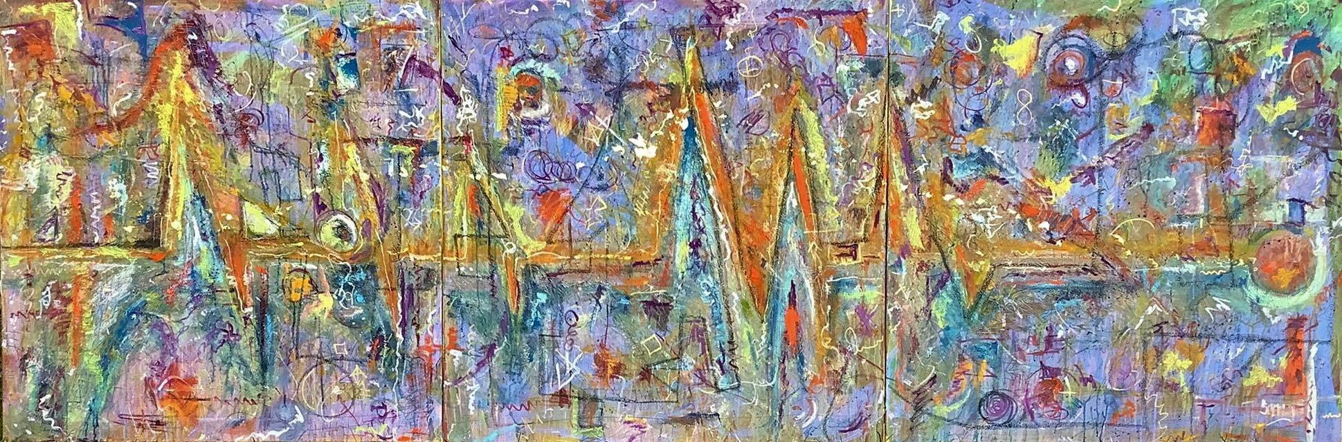
Over a month ago I was contacted to do a commissioned abstract. The client knew my work and gave the basic colors that he wanted to see. I set off doing what I do it the size he wanted 40”x60” vertical. I get asked to do commission work several times a year, sometimes landscape, other times figurative & every once and a while an abstract. Each are within my subject matters that I regularly paint, plus within my more contemporary & modern takes on them.

I remember my first commission, in high school. It was a portrait in pastel. When I completed it, the girl wasn’t 100% thrilled with it. She asked if I could remove the space between her two front teeth. I remember thinking, ‘I’m not an orthodontist.’ Years latter I would be called on to paint another portrait, this time in oil. The person had departed this life, so it was important. This time, it was the space between his teeth that was an important identifying feature of the persons appearance. Besides the fact that my portrait work is more stylized, meaning not being a photographic rendition. How we see ourselves isn’t always how others see us, which can make portrait work more difficult, landscapes are infinitely easier, grass is greener.

I’ve painted images from peoples vacations where they didn’t get that perfect photo so I’ll merge the photos they’ve taken into the perfect painted memory image. Sometimes they’re paintings of their favorite place, a garden, a vacation spot, or a lake home. Recently I was asked to paint someone’s vacation home in northern Wisconsin on a 5” wedge of pine that was being turned into a table and given to one of his children as a wedding anniversary gift. How fun and really pleasure to do for a variety of reasons, some of a more sentimental leaning. The abstracts are a lot of fun because if you already like what I do and my approach, it’s play time for me. I like taking photographs and breaking them down into a more contemporary abstract realistic form. I hope to get commissions doing that with someone else’s photo sometime, it’s also a lot of fun the results are so unique. One of these type artworks recently received an ‘Artistic Excellence’ award from Spotlight Magazine in April 2023 & just a month later this May, this piece was featured in ARTISTCLOSEUP an international magazine that features artist from all around the world, each so nice.

With this piece, I asked for the size, the colors & the space it would be hung in. The client gave me the info & sent photos. I went to work doing what I do layering in, the brushed, palette knifed & sgraffito-ed, mixed media extravaganza, including the hidden infinity sign & 18k gold which have become my signature, of sorts, in these type artworks.

Nearing completion, I sent an image of the piece to the client, he responded, “Interesting. I’m a little scared of the orange, but I like it.” I reassured him I could tone it down if he wanted but felt he should see it in person first & we could pick out a frame. Having now seen it in person & feeling the orange was to bold for his taste. It was decided that I’d do some adjustments & enhancement in those areas, thus making then a bit more rusty. He was hesitant to have me make the embellishments and very respectful of me and the art. I felt it was a commission and wanted it a more parallel vision tailored to his taste and went back to work. Completed, I sent an image for his review. His response was an enthusiastic, “I like it!” After its framed and hanging in his home, I’ll add that photo as well so visit again, soon.

Your questions & commissions are welcome, Richard

Ascension 40”x60” mixed media

placement in home

placement

Art, Nature & Soul #63

An artist friend wrote to me in regard to an abstract expressionist piece I had just completed & posted on one of the social media platforms I’m on.

Gabriela M. from Argentina,

“This one is guarding her! I liked it a lot! It reminded me of another face.de Abstraction that I did.. that I adored and here they purposely upload Realism to moan... no need to bother Antiques. I already showed that I do Realism well and I prefer Abstract... and other styles Like minimalism or Informalism and Suprematism included in the line of Abstract. and I generate 4 lines discovered by me that I upload them and they don't support me, maybe a chicken with potatoes. or a worthless cartoon. guys no one knows who he is! He doesn't even do it. It's clear that being an artist is not being these people! Fight FOR your taste. friend. luck!!! There is nothing that suits them good only evil.. the discouraged. envy me being me. bad people. thankful that I have some friends who pretend to be seen. They talk to you. they support you. . the other ghosts!?”

“The other ghosts”, and yes most of us can draw & paint the more realistic and representational, as well, but we are the persons who see beyond the more traditional conventions of the day. It’s interesting how some viewers, other painters included, simply do not understand it or get it, abstract artwork that is. To me it seems so simple. I found myself explaining my work to an interested party, enticing them to participate at the gallery, just the other day, when they remarked, “You do everything,” in regards to both the representational and abstract nature of my work. “Can you tell me a bit about it? What inspires you?"” To which I responded , “I feel they are the same and play off each other. Do you know what fractals are? Patterns within patterns that exist in everything under a microscope to those seen from the largest telescope. Energy traces, the patterns are echoes of each other, from the smallest to the largest, where as chaos can change the patterns,“ I explained. Creating a square template, as a view finder, holding it over a 5” area, keeping composition in mind, over one of my representational artworks, stopping, I said, “here’s a small abstract, now imagine it 36” x36”. They both immediately got it, continued to look at my abstracts, then I added, as a response to what inspires me, “Everything, I see something, think a thing, have an idea and just have to paint it…I’m usually working on & building up 3-6 pieces at any given time.” That said, in the universe I’m working, there’s no lines separating us, only edges that connect us. I try to keep it free flowing, natural & organic, plus there’s lots of symbolism & mythology used in my abstract works and more obvious ones in the representational artworks.

.Interestingly, with the representational work, once I choose a subject they move along rather quickly and most directly, over several hours or days, to completion. Where as the abstracts, I begin with a basic idea and build off it over days, weeks, & sometimes, over several months, as I evaluate my next move, adding & subtracting visual information. This piece has more scribbles, marks & erasures then most of my other artworks of this nature. They are very difficult to photograph and capture their true depth and scope. More so they are best appreciated in person as the layering of mediums draw us in with an hypnotic quality. The mediums used are acrylic & oil paint, oil pastel, ebony pencil, charcoal , 18k gold paint marker & gold leaf. The 18k gold leaf & infinity symbol, has become my trademark, a signature of sorts, on most of my abstract artworks. Like peeling an onion, so then are the thoughts in ones mind, as are the layers of meaning within this piece. Adding & subtracting, making marks & erasures made, until finally the vision is complete for others to ponder & create their own stories within, which fascinates and is always what I want, the viewers participation and engagement, as my story ended when the piece was completed.

*Note~Having been suddenly struck and engaged by my abstract artwork, which led to an in-depth, but upbeat & fun conversation, about how & why I do what I do, to which they responded by acquiring not 1, but 2 pieces. Both 'Catharsis' & 'Eye of the Fire' 32"x32" framed mixed media, have found a new home & I couldn't be more grateful & thrilled

Your questions are welcome, thanks, Richard

‘Scribbles, Marks & Erasures’ 36” square mixed media by Richard Sperry’

‘Scribbles, Marks & Erasures’ 36” square mixed media by Richard Sperry

Art, Nature & Soul #51

The idea comes first. Once the basic concept is in my I head though, I’m ready to paint. We painters have our favorites too. The creative process in these works, are a slow burn romance, assessing and re assessing as I add details, build & go on. Here's one of mine from last year, that was a couple months in the making of scribbles, marks & erasures. If you’re painting a person, place or thing, generally you know what they look like, so then you come up with a composition, then execute it to the best of your abilities. With my more abstract artworks, often times, at least with mine, you’re creating the image from scratch, from your imagination, a personified reality. For me, all the same design elements apply to abstract artwork as they do to representational. Most of you know I’ve been working toward merging both types into a singular expression of envisioned thought, Such is the case with “Love’s Lines, Circles, Angles & Rhymes” .

Here I took the idea from a photo of 2 people embracing in a space, created a composition and broke them down into their essential qualities, and elaborated on them. The Elements of Design are the things that as an artist I work with to create a design, or composition. The Elements are: line, shape, space, value, color and texture. The elements, or principles, of visual design include Contrast, Balance, Emphasis, Movement, White Space, Proportion, Hierarchy, Repetition, Rhythm, Pattern, Unity, and Variety. Again, with the information in front of you visually, representational work is potentially a much easier task. That said, in both disciplines, one of my concerns is that it not look static or contrived. I strive to create a seemingly spontaneous, instinctive, or intuitive yet intended , if you will, visual imagery. Intuitive painting is an opportunity to explore the inner self through the creative process in a safe, critic free environment. ... This approach to painting is focused on mindfulness, creative permission and the act of spontaneous expression., as in automatic.

In this case, after a 5 color splash painting in acrylic, including several interference colors, I sketched out the basic lines within the space & went to work with my oil paints. First blocking in various shapes in color. Once these features are in place the painting leads me as I analyze the various design elements as they begin to emerge. Each layer becomes a stream of conscious methodology of adding and subtracting from the whole and in part the mediums are the message. Adding oil paint to block in shapes, scratching through the layers and erasing as directed by the piece. After a second round with the oil paint, I begin adding line & scribbling with ebony, pencil, grease marker, & oil pastel…each giving their own aesthetic detail and sense of depth. Then enhancing the emerging mythology with 18k gold pen near completion as I add the 18k gold leaf, signing the completed piece.

These artworks evolve over time, with each medium and each layer, I leave and visit the painting, over and over again, evaluating the whole, over months until my vision is complete. I hope you’ve enjoy the journey, making part of it your own too. As always your comments & questions are most welcome.

~Richard

’Love's, Lines, Circles, Angles & Rhymes’ 40”x40” mixed media on canvas

’Love's, Lines, Circles, Angles & Rhymes 40”x40” mixed media on canvas.

’Love's, Lines, Circles, Angles & Rhymes 40”x40” mixed media on canvas.

Art, Nature & Soul #44

So it was, I had a title in my head and set out to express it, paint it…’WILD ABANDON’. I had three 36” square stretched gallery wrapped canvases ready, in which to do so. My thought was to make each panel strong enough to stand on their merit, but wanted a unifying thread. After some thought, the idea of a cardio rhythm was settled on, combined with certain universality in all things. A life in 3 parts conveyed, the first being birth through adolescents, second, the young adult through middle age & the third panel, the waning years and the heartbeat stops, to the unknown & ubiquitous nature of things.

And so it began, a drip & splatter layer of lemon yellow, followed by another in prism violet, enhanced by an interference green then blue coat, all in acrylic paint. Then I drew the cardio rhythm in and began working my oil paint palette on the canvases in an intuitive, but concise manner. Moving between the oil paint plus ebony pencil, 18k gold paint & white china marker, I added symbols, both known & unknown ones created and designed specifically for this composition. Layer upon layer, creating scribbles, marks and erasures, where needed to complete the intended dynamic, emotional impact & elements of design, such as line, direction, shape, size, texture, value, and color. Working back into the canvases & sometimes over them in both oil paint & oil pastels, over a month 1/2 or so, nearing completion, black charcoal & 18k gold leaf are added and carried through in each panel. After considerable visual re-evaluations & assessments, it was complete.

I had posted a detail of one of the sections while I've been working on this piece. One of my Friends asked. "What's your inspiration?" This was my answer~ "Life and all it's complexities. Especially in my abstracts, layer by layer, pattern by pattern, expressing the idea of fractals, chaos, unity plus the thought that all life is connected, in these things, from the tiniest to the largest. Sometimes what looks like the sun setting is really the sun rising. For continuity, I used a monitor heartbeat as the vehicle in which to carry through the 3 images" ~me

Those who know me, know I’ve been raising Shiba Inu pups for the past 25 years. So, I went to post a photo of the pups on Shibaholics on FACEBOOOK and accidently posted along with the photo of the pups, this artwork, plus a Ganesha sculpture, I own along with it…here's the conversation that transpired between a few members~

Jenn Barber M.

What’s the artwork and that light blue piece?

Ann S.

shiba ears = heartbeat rhythm?

Ann S.

Very interesting either way tho I say maybe he will add more input

Jenn Barber M.

Yeah, that’s why I was wondering. I really like the pieces!

Ann S.

Jenn Barber M., then again Blaze could be represented by the flames like pattern in painting and could that be blue jade or amber (dog names) hmmm

Ann S.

The blue symbol

I need a nap

Image of Ganesh Poster a3 India Hindu Elephant God for Success Pri... Lord Ganesha POSTER reproduction print for home wall'

Jenn Barber M.

By the time he responds, we will have already made up our own stories. The blue thing must be a still-frozen dog treat left behind from a glacier.

Ann S.

hahahha right?!?

Richard R. Sperry

Sorry, I'm an artist. Must have all been in the file and yes, I love the stories you've created. That's what it's all about. I'm an artist and the Ganesha is a larimar sculpture I have. I love how you all created stories though. Sorry it took time to respond.

Richard R. Sperry

Ann S. & Jenn Barber m.

, you both have me laughing so hard I had tears rolling down my face....Thank You!

Jenn Barber m.

Ann, would you believe we were wrong? Lol. But I really like the painting, Richard! Enjoy your vacation.

Sheryl S.

Keep the storyline going. This is fun.

Available, contact me for further info. As always, your thoughts & comments are welcome,

Richard

WILD ABANDON, in 3 parts, each panel is a 36” square mixed media on canvas

WILD ABANDON, in 3 parts, each panel is a 36” square mixed media on canvas

WILD ABANDON, in 3 parts, each panel is a 36” square mixed media on canvas

Detail from 3rd panel

Detail from 3rd panel

Framed 112”x38” and available at Proud Fox Gallery & Frame Shop

Framed 112”x38” and available at Proud Fox Gallery & Frame Shop

Art, Nature & Soul #33

More important than trying to copy the world around us, is how we see, then how its expressed and conveyed in our non rep and representational forms in our artwork.

Earlier this past fall 2019, out walking one morning, I noticed the first light hitting just the top of this Maple Tree, some 15+ years ago, I noticed that this is where the color changes first happen on the leaves. It was at the point where the leaves where glowing that yellow, orange, red, punch color…or a glowing Ranier Cherry one. It occured to me to paint one version as an abstract and another as a representational interpretation. How we build up the details, or take them away will determine the translation between more design orientated and realistic paintings.

For as long as I can remember I’ve drawn as well as painted both abstract and more realistic images, seperately, then have merged them into mixed singular concept. A great many, dare I say, most people like more representational art. It’s easy to relate to, identify with and put your self into it. I get that, that said, many, many peope ask me about abstract artwork, because they don’t get it. Over the years I’ve found the most simple way to explain it and show it. For the most part, abstract work is about breaking down the design elements of what we see and the more realistic is building up those elements & the details to various degrees. Then I’ll show them, by creating a square or rectangle window, using it as a viewfinder and placing it over a section of a representational artwork. In picking a more interesting area of a painting, showing that all the same design elements apply, thus creating an abstract.

In these studies, these paintings, I specifically set forth or average the amount of detail in both, approximating them at a similar level. Neither is to broken down or built up, in detail too much, as to mis the point. Sometimes I paint on location, other times from photos, still others from my imagination. In this case all 3 apply. I began with a toned canvas, decided on a more high key lit color and went to work. Here’s the results. For the abstract translation, I painted just the upper section of the tree against the sky and for the more representaional one, the whole tree, & treeline against the sky, keeping both on the subtle line of impressionism. Here are the results.

Please feel free to comment and ask questions.

~Richard

Fall Maple Translation 1 & 2, 18”x18” each oil on canvas

rs3.jpg
rs4.jpg

Art, Nature & Soul #24

Blue has always been my favorite color. Those of a more color sensitive nature, will appreciate the tonal nature of this piece and the line I’m playing between abstract & representational art.

We went out to Cape Cod, back in 2014, it had been over a decade since I had been to the ocean. Where the vast sea and sky meet, has left a lasting impression on me. I have painted both abstract and representational artworks for over a quarter century now. Typically they have been seperate entities, with an ocassional mixing of the two on the same canvas. In an effort to unify my body of work, I began trying to break down representational ideas into they’re more abstract forms, with the intention of leaving some of those representational things intact, on the canvas.

Having studied some of my most favorite artists, both living and dead, approaches to achieving they’re goals in their artworks, I set forth to create my own trademark look. The thought being , not to do what they do, but to discover what makes/made their work successful, make my work better and perhaps apply it to my own. The list of artist is to long to state here, but you may be surprised at who they are, so ask me sometime, I’m glad to share and promote them. Myself having mostly experimented and having very little formal training, found this to be a revelation of process’s.

Here is one of the early results of a more tonal concept & approach. A variety of blue and white paints, a multitude of painting tools, a complimentary color toned canvas and the inspiration that the sea & sky provided, along with the words of one of my favorite American thinkers.

“Live in the sunshine, swim the sea, drink the wild air.”
― Ralph Waldo Emerson

As always, feel free to ask question or comment,

~Richard R. Sperry

Blue Haze' 24"x24" oil on canvas in private collection

10983181_10203028348828750_1615581383117146537_n.jpg

Art, Nature & Soul #19

Often times, people ask me, “What do you think about when you’re painting” & “What’s your inspiration?” The truth is, everything. I’m a highly sensitive and emotional person, so I tend to interalize the whole of my experiences and hopefully constructively express them, mostly as the vehicle, in the form, of my artworks. These questions are asked even more in the context of my abstract works.

Having spent years refining my drip, splatter & splash techniques, this piece emerged. What I was thinking about and it’s inspiration, was quite simple th canopy of a maple tree in fall, under a misroscope. When the blast of sunlight on it is so strong, that at a certain time, in changing colors, it glows like Hawaiian Punch against the intense array of shadowy color. Imagine a close up of the leaves and there you have it.

When I finished it, I felt it was a strong piece and posted it on Facebook. Soon after, one of my FB friends commmented,

“Just set this as my iPhone screen ;)” -ERIC P.

(about 4 years later, he added the original piece to his collection.)

Thank you collectors. I’m so grateful for people who see outside the box and trust in it.

As always, feel free to comment.

~Richard

‘Windows 1’ 24”x24” acrylic on canvas (2012)

P3083385.JPG

Art, Nature & Soul #17

What is ART? More importantly who decides. Are the answers based on academics or emotive ones, is it because it's realistic or non-objective, does the fact that a painting was done in oil rather than acrylic have any weight, or perhaps it's the fact  that it was painted 'en plein air', instead of in a studio, gains us some insight.

Whether, it's highbrow/middlebrow/lowbrow, who cares. Van Gogh, Monet, Vermeer and El Greco are several visual artists, who had gone, rejected or un-recognised in their own lifetimes, someteimes both. So many others were discovered and advocated for, by persons of influence and decisiveness, within their lives, such is the case with Jackson Pollock. Personally, I know of at least three instances of persons being summoned to the court of high success. What they all had in common was the abitlity to put themselves out there, at all costs, until they gained an audience with that person or persons of influence, sometimes by happy accident. Once this happens, your in, it's art, for many this happens posthumously,  their efforts go un-recognised until some future date and sometimes never.

 What can be known for sure, is that being an artist of any sort is an uphill battle all the way. It takes an unbridled passion, discipline and fortitude.  As for me, my 'pallete' is extremely large and varied, when it comes to 'what is art'. It's an endeavor, often thoughtful, historical and relevant, to its time and speaks to the context of the creator.  It's what inspired a person to create something of a non-utilitarian purpose. A person who is merely struggling to grow as a human, as artist and make their statement about life and the world around them, as they experience it, see it.  The history of art, what it is, and who decides, is as long and complicated as the story of human history itself.  Whether you started creating at age, 1 or 101,  create in crayons, oil or other materials; are the most apt realist or most compelling minalmalist abstract artist, who decides if it's art are the people who purchase your artwork, show it, collect it, now, or in 25, 50 or 100 plus years, later.

While you may 'like' or 'not-like' it, if it's in a museum the broader concensus, is that it's art. But, that's another subject. fore it ,speaks to your personel sense of aesthetics. That said, most people,  seem to rely on the leaders, for their decision making, as to whats good, what's art, and fall in line with such. So when those persons of influence, that gallery that took a risk, the art fair that juried you in, that exhibit you were allowed to participate in, that magazine that wrote an article, those individual family members, friends and persons from around the globe, decide to purchase and acquire a piece of your work, declaring it to be art. Thank them, for in the final analysis, what art is, is in fact in the eye of the beholder, so it's most important to be grateful to those who behold yours, declaring it 'ART'.

Thanks everyone; family, friends, patrons, collectors, sponsors and benifactors, for your continued support and as always feel free to comment. ~Richard

'Eye of the Beholder' 36"x36" acrylic on canvas (yr.20  ) in private collection

36x36.jpg

Art, Nature & Soul #16

I love a road trip, heading down the highway, an adventure to destinations unknown. Growing up, I remember my family driving all over the country on various trips. Mostly camping, or visiting family, although sometimes they would be to explore historical sites. As I grew older, hopping on the train, or taking off in my car seemed second nature. To this day I still get that adrenaline rush of anticipation as I turn up the music, have the camera ready and hit the road.  Life is about the journey, not the destination.

During this time frame I was taking representational subjects and breaking them down unto their abstract forms. Dripping and splattering the paint attempting  to control the chaos. Besides having a vivid color palette, which colors I applied first became crucial to the dynamic dimensional aspects conveyed. Putting the sky in last, allowed the blue to drip across the entire landscape creating layers of depth.

These artworks seemed to have a theraputic value, a cathartic aspect to them, plus they were so fun to do. As always feel free to comment.

'Meditations 8, the road trip, 22"x10" acrylic on linen, (yr. 2011) in private collection    

Meditations 8, 22x10, Acrylic on Linen.jpg

Art, Nature & Soul #8

A decade or so ago, I was creating primarily in acrylics, using a drip, splash, splatter and palette knife approach, with subjects being both abstract and representational in an attempt to merge the two concepts into a unified idea.

I love walking and nature and spend lots of time outside doing so, observing it and trying to take it all in. I'm fascinated with the idea of fractals and overcome with the idea that those patterns echoe and ripple, no matter how large or small, on and on into infinity and back. They whisper to me, that all life regardless of its differences, is connected to each other in a symbiotic relationship. 

There are paths to choose, decisions to make, and no matter which ones you do, to most there is a way re-route, if only  you keep moving forward, being true to yourself. Some of us take a more direct route to get to a destination as quick as possible. Others of us prefer the more circuitous routes and  scenic by-ways. I've been more of the latter, wanting for the thing that eludes us most, the abilty to put our whole selves in the moment and breath it all in.

This piece is inpired by a forest preserve by my home and one of the paths I've walked over a great many years. What began with a blank canvas, was stretched over strainer bars, primed, then slowly color glazes were applied, again and again, until, with a palette knife the path was clear and subtle details were added to journey's end.   

'Sky's the Limit' 24"x30" acrylic on canvas~SOLD     

31832_1180297446693_2269167_n.jpg

Art, Nature & Soul #6

From my earliest memories of drawing, my primary interests were of people. There are even ones in crayon, around my studio, that were done when I was 6 or 7 years of age. Throughout my childhood you could find me doing drawings of the people around me, mostly cartoon or caricature in style. Sometime in middle school my interests in Leonardo Da Vinci and a more realistic approach took hold as did my medium of choice being pencil. Later in high school, pen & ink cartoons, of all my classmates and teachers, then followed by some commissioned portrait works in soft pastel. While I found realism a struggle and favored the more stylized or caricature works, I had it my head to become a portrait painter and studied that for a time. In my 20s, I really wanted to study with a local rococo style portrait artist, but did not happen, then later took a Rembrandt style portrait class at the SAIC. Life is demanding, our priorities are often dictated to us, as such my openness to to impressionism, post impressionism and expressionism opened up a wide berth of creative outlets and opportunities for artistic growth.  I explored these arenas of art and found them more conducive to the particulars of my life. Over the past decade or so my primary subjects tend to be more landscape and abstract, either building up those basic design essentials or breaking them down into their essence. However, I still love people, doing realistic figurative work and sometimes I have the opportunity to do such. This was the case in this piece and became a merging of learning, mediums, subjects and ideas. Feel free to comment or ask questions. 

Thank you for your support. ~ Richard

'Dream Sequence #50' 24"x20" mixed media on canvas    

P4178012.JPG