Art, Nature & Soul #46

Earlier this year, summer 2020, I was able to attend the MONET Exhibit at the Art Institute Chicago. Having been creating art since I was a young child & having been in the art, design & custom framing business low these 35 years past, I’ve come to understand that art is a lifelong pursuit, passion & learning experience. Currently on my larger more detailed artworks I’ve been doing more layering of color, especially in my mixed media pieces. Having got up close & studying these master works of Monet’s, I observed, that from a distance, like in a photo our eyes averages the image to their beauty, but that viewing just inches from the surface and having done some reading on the subject, discovered they are but layered amounts of pattern and paint done not, for the most part, in one sitting(alla prima), but many outdoor sessions (en plein air)and finishing up in the studio. As with all things, I’ve taken a more unconventional way of achieving my own goals, in observation and in execution, and in this case a more abstract realistic approach in my artwork, thus ‘Stairway to Heaven’ lyric is constantly playing in my head. But alas, here we are .

“If there's a bustle in your hedgerow
Don't be alarmed now
It's just a spring clean for the May queen
Yes, there are two paths you can go by
But in the long run
There's still time to change the road you're on
And it makes me wonder”

Zeppelin (Songwriters: Jimmy Page / Robert Plant)

I work from life, photos & my imagination. In this case I took 5 different photos and created the desired composition and dynamic you see here. Each of the photos had different elements I wanted to show and express, from the varied flowers, color & shapes, to the grown over path that runs through the center of the piece. From creating the composition, until its completion took about 3 weeks. It’s all about the layered in mediums and the slow build, in these type works.

In this piece I wanted both the muted undertones, as well as the bright light high key ones. I began, as always with a drip and splatter underpainting, this one in an acrylic prism violet. Then, using a brush, laid in the colors intended, taking my palette knife and blending them together, to a muted coloration, while blocking in shapes, thus creating the preliminary composition to build off of. Once achieved, several palette knives, scratching tools, brushes and tissues were used to move the the paint around to create the image of a natural flower garden. Ebony pencil & 18k gold pen were used to enhance line and give depth. Oil pastel was then used to give more texture, color & pattern, enhancing the broken color and giving the more free design elements of scribble. My trademark of 18k gold leaf was laid in at the top, in the path as light hitting the edge. Taking my palette knife and pure color straight from the tube, I moved about the canvas dropping in bright happy color, thus scratching in my signature, it was complete & posted on social media.

*Me~ Woke up about 1:30am and couldn't get back to sleep, rolled out of bed about 2:30am...had some tea, read some Vonnegut and completed this 48"x24" mixed media piece, but it needs a title, any ideas???

One of the many, many responses was from a collector of my artwork. While I had been reading Vonnegut’s ‘Bluebeard’ ( a tongue in cheek romp through the abstract expressionist movement of the 50s) earlier that morning….Chris’s sentiments reminded of another of K.V.s novels.~

Chris G.

“Visions of Vonnegut. Very cool.”

In 79’-80’ish I read 'Slapstick' it was my first Kurt Vonnegut read. I was immediately hooked. If you haven't read it, it's a futuristic tale in which all the people of the world are assigned middle names, of flowers randomly. Wilbur Daffodil-11 Swain, is the main character. Which ever flower you are, connects you to all the other like flowers, as family, so you are never alone. I'm partial to sunflowers, so that makes me Richard Sunflower-1 Sperry. What’s your flower? Are we family? Here’s where we all gather, mingle and dance, in the sun and a light breeze. After some thought a variation was settled on.

'Vonnegut's Garden' 48"x24" framed (a white traditional frame, as seen or a more contemporary clean line, black frame, its your choice) mixed media on canvas, $2400.oo. (plus a complimentary mini-me 12" square oil of your choice a $350.oo value). Message me with further questions on how this can be acquired. It can be shipped. (free mini-me of your choice with purchase of ‘Vonnegut’s Garden’ expires 12/31/2020)

preliminary underpainting, an abstract

preliminary underpainting, an abstract

Vonnegut’s Garden/completed

Vonnegut’s Garden/completed

Center detail

Center detail

framed in a traditional white, though a contemporary clean line black, works well too.

framed in a traditional white, though a contemporary clean line black, works well too.

a more contemporary, clean line, black frame

a more contemporary, clean line, black frame

Art, Nature & Soul #45

*For me, the best thing about Facebook, has been connecting with friends and family, meeting new people from all over the country and even more so, the world. Early November last year 2019, one of my Facebook friends, an artist in France, posted that her grandson had passed on. I was moved, even more so feeling compelled by an overwhelming sense of compassion to create a memoriam, a tribute, a painted 'Homage to Francis' , her grandson, a person I did not know, for a person I know only through Facebook. I gathered from her posts the information needed, hoping to honor his life, in some small way, from the brief glimpse I was allowed to share in. My greatest desire was to convey that when a young person is taken so soon, when they pass on, that you are not alone, for the whole world mourns with you and for them. To create a visual assertion that sometimes what may look like the sun setting, is really the sun rising. To say, we are one, of one world, one love, and in this oneness that we are not separate, but completely, utterly and powerfully connected...always.

After gathering images & info to work from, I choose a 36” square stretched canvas and did a tonal drip & splatter in prism violet as a base color in which to do my preliminary figure sketch & wash upon. Using my oils blocking in the shapes, the figure began to emerge. I tend to work wet in wet, however in this piece some dry brush enhancement and details were added over time. Next, using ebony pencil & 18k gold marker, a bit of graffiti was added in both word and symbols. Each symbol & word, were meaningful additions to the memoriam. Some were direct pieces of information & images from his life. A few like a victor Hugo quote, important dates, his name FRANCIS, were all carefully added, as were the symbolic imagery, such as my trademark figure 8 or mobius strip, representing eternity. Also the signature addition of 18k gold leaf was added toward it’s completion. In this case, depicting the soul as an angel. A multitude of others exist within the composition if one takes the the time to look for them and ponder their meaning, as does the expression on his face suggest. As usual I tried not to over think my approach, but let my emotions & more intuitive instincts prevail.

"I say that on the tomb , which on the dead closes - Open the firmament . - And what here below we take for the end - Is the beginning ." ~Victor Hugo

Upon completion, I contacted & messaged my Facebook friend showing & telling her what I had done and affirming that it was painted with the utmost respect & love, asking permission to post it. She responded~

“Many thanks dear Richard for your paint , I like very much your hommage of Francis , je vais partager”

J.R.-R.

The response was a success & overwhelming, the ‘Homage to Francis’ seemed to speak to and reach the hearts of those I had hoped to.

Art should speak volumes to the time in which its created, to the thoughts, the people, & places of those fleeting moments we call life. My sincerest hope is that this piece does.

As always your comments are welcome.

~Richard

'Homage to Francis' 36"x36" mixed media on canvas

Homage to Francis’

Homage to Francis’

Detail

Detail

Art, Nature & Soul #44

So it was, I had a title in my head and set out to express it, paint it…’WILD ABANDON’. I had three 36” square stretched gallery wrapped canvases ready, in which to do so. My thought was to make each panel strong enough to stand on their merit, but wanted a unifying thread. After some thought, the idea of a cardio rhythm was settled on, combined with certain universality in all things. A life in 3 parts conveyed, the first being birth through adolescents, second, the young adult through middle age & the third panel, the waning years and the heartbeat stops, to the unknown & ubiquitous nature of things.

And so it began, a drip & splatter layer of lemon yellow, followed by another in prism violet, enhanced by an interference green then blue coat, all in acrylic paint. Then I drew the cardio rhythm in and began working my oil paint palette on the canvases in an intuitive, but concise manner. Moving between the oil paint plus ebony pencil, 18k gold paint & white china marker, I added symbols, both known & unknown ones created and designed specifically for this composition. Layer upon layer, creating scribbles, marks and erasures, where needed to complete the intended dynamic, emotional impact & elements of design, such as line, direction, shape, size, texture, value, and color. Working back into the canvases & sometimes over them in both oil paint & oil pastels, over a month 1/2 or so, nearing completion, black charcoal & 18k gold leaf are added and carried through in each panel. After considerable visual re-evaluations & assessments, it was complete.

I had posted a detail of one of the sections while I've been working on this piece. One of my Friends asked. "What's your inspiration?" This was my answer~ "Life and all it's complexities. Especially in my abstracts, layer by layer, pattern by pattern, expressing the idea of fractals, chaos, unity plus the thought that all life is connected, in these things, from the tiniest to the largest. Sometimes what looks like the sun setting is really the sun rising. For continuity, I used a monitor heartbeat as the vehicle in which to carry through the 3 images" ~me

Those who know me, know I’ve been raising Shiba Inu pups for the past 25 years. So, I went to post a photo of the pups on Shibaholics on FACEBOOOK and accidently posted along with the photo of the pups, this artwork, plus a Ganesha sculpture, I own along with it…here's the conversation that transpired between a few members~

Jenn Barber M.

What’s the artwork and that light blue piece?

Ann S.

shiba ears = heartbeat rhythm?

Ann S.

Very interesting either way tho I say maybe he will add more input

Jenn Barber M.

Yeah, that’s why I was wondering. I really like the pieces!

Ann S.

Jenn Barber M., then again Blaze could be represented by the flames like pattern in painting and could that be blue jade or amber (dog names) hmmm

Ann S.

The blue symbol

I need a nap

Image of Ganesh Poster a3 India Hindu Elephant God for Success Pri... Lord Ganesha POSTER reproduction print for home wall'

Jenn Barber M.

By the time he responds, we will have already made up our own stories. The blue thing must be a still-frozen dog treat left behind from a glacier.

Ann S.

hahahha right?!?

Richard R. Sperry

Sorry, I'm an artist. Must have all been in the file and yes, I love the stories you've created. That's what it's all about. I'm an artist and the Ganesha is a larimar sculpture I have. I love how you all created stories though. Sorry it took time to respond.

Richard R. Sperry

Ann S. & Jenn Barber m.

, you both have me laughing so hard I had tears rolling down my face....Thank You!

Jenn Barber m.

Ann, would you believe we were wrong? Lol. But I really like the painting, Richard! Enjoy your vacation.

Sheryl S.

Keep the storyline going. This is fun.

Available, contact me for further info. As always, your thoughts & comments are welcome,

Richard

WILD ABANDON, in 3 parts, each panel is a 36” square mixed media on canvas

WILD ABANDON, in 3 parts, each panel is a 36” square mixed media on canvas

WILD ABANDON, in 3 parts, each panel is a 36” square mixed media on canvas

Detail from 3rd panel

Detail from 3rd panel

Framed 112”x38” and available at Proud Fox Gallery & Frame Shop

Framed 112”x38” and available at Proud Fox Gallery & Frame Shop

Art, Nature & Soul #43

Mini-Me’s~Are a more raw & direct approach to my painting. Most certainly completed in one sitting, they assert & express, my more intuitive & free associative natures. These are the pieces I most experiment with, pushing the color combos, textures & general approach, with a matter-of-fact intent …Alla-Prima.

Playing in the paint, immersed in the color, & bathing in the light, my tools are ready to translate the world around me. I had in the past been working on various size canvas/panels for these smaller artworks, but this year I’ve decided to stick to the 12'“ square panel format, as I had a great carrier created for traveling with them. Initially intended for my Plein air works, it also works as a perfect drying rack. Working mostly from my own photo references, life, imagination & plein air work, over this past year, as the pandemic has limited my abiltity to travel and get new references. Recently, I have on occassion also incorperated, when inspired, Facebook friends & family, photos, as references for these studies. Usually a big no-no for me, as I have always worked from & used my own experiences & references in previous years. Now, though, inspiration is sweet inspiration, besides I’m not a literal interpreter of the more realistic.

My aresenol of supplies & tools, are an expanded palette, of color, color & more color. Having learned the limited palette of Rembrandt near 3 decades ago and knowing how to expand the color variety within that limit of, Titanium White, Ivory Black, Yellow Ochre & Venetian Red, I now challenge myself to create, blend, layer & mix new colors, to push the palette to a sublte extreme. As stated I’m using panel, ‘Richeson 12”x12” gessoed hardboard to paint on, for the most part. Then a variety of brushes, palette knives, scratching tools, sculpting tools, make-up applicators, kleenex, my fingers, medium & finishing varnish.

These artworks can be framed or placed on an easel, as they are. They are small, so they are easy and inexpensive to ship. Whether a collector, or new to the scene, they’re a great way to expand or start an art collection.

As always, feel free to comment or contact me if interested in acquiring a ‘SPERRY’ original.

Thank you

Richard Sperry

new20201.jpg

Art, Nature & Soul #42

My Muse~Beginning about 10 years ago, my daily routine included a 5-10 minute, morning quick sketch. A doodle or drawing of a facebook friend, from some photo they’d posted. It was usually a person or animal, that would catch my attention. The idea was to force me to see, apply an automatic drawing sensibility, to how I saw and put it down on paper without over thinking it. It was great fun and the results were an enlightening excersize. Sometimes their natural state of beauty & vulnerablility, being of both a physical & emotional presence, captures my attention & imagination. Such is the case with Nathan, which began with a simple gesture, a line sketch of his face, that exudes an uncanny depth of character & soulfulness, you know “je ne sais quoi”.

After contacting Nathan and getting his permission to continue drawing him, I found a beautiful person & compelling subject in him, and so I began painting him as well. What intrigues us, compells us to create. Faces are always of great interest and intrigue to me. They have the possibility to speak volumes in a single look. The soulfull eyes of a free spirit penetrate all, in their gaze. A unique nose has always fascinated me, as well…Personality, with a fearless zest for life, he wears every piercing, gage, tattoo and line in his face as a triumphant and well earned, battle scare of sorts, in some unwritten tribal & communal right of passage. For all those who take the road less traveled, he seems to say, “this way, I’ll leave a trail.”

From simple line drawings in pencil and pen & ink to portrait studies in acrylic and oil, my muse captured my imagination. So, we’d work a pose as I began to paint full figures, as well, some in real space and others in imagined. At one point I painted him more realistic, but in an abstract space, in oil, then still another, and finally merging him in one more piece, more recently, a comtemporary abstract realist painting, a mixed media, all with my signature mark of 18k gold. Drawing and painting someone, over and over again, is really a quite intimate affair, whether admitted or not. It reveals as much about the artist as the subject, again reuntiting my inner rebel & my former youth. What I have realised most, is that I have a unique & ever distinct way of seeing, one that goes back to middle school, of my first recollection. It seems, more than a likeness, but a way of capturing the essence & energy, of the true spirit of that person of interest. It’s with much gratitude, to all those who serve as inspiration and models for my imagination that I say thank you, with special recognition & appreciation for having served for many, many years as my muse, Nathan…one of the beautiful people.

As always, feel free to comment & ask questions,

~Richard

1-nathan11.jpg
Nathan

Nathan

Art,Nature & Soul #41

I was working at a higher end art gallery & frame shop, & had taken a brief 4 year respit from painting, to learn the business well, & from trying to make my mark on the world. HA! Toward the end of 2004, we took a trip to Bar Harbor, Maine, third week of October. It was B-E-A-U-T-F-U-L. I’d not uttered that word, that often, before or since. I think it was, in part, the fall colors and light were especially spectacular that year. In any case I began painting some more post impressionist landscapes, some with figures, in oil. I’ve always embraced experimentation in my artwork & have a had a great many influences, from both the living and dead artists club. Before long I was getting in the groove, again. About a year later, a loved one took ill & in a few short months, passed on. During this time, with these things happening simultaneously, I had begun a series of paintings, that would change the direction of my life.

Being the highly sensitive person I am, and with a departure from my regular post impressionist work, I began drawing on some ideas and techniques I began playing with 15 years prior. Cathartically, as a therapy, the drip & splatter beginnings are my way of finding and getting in touch with the rhythms of nature…life. Hence, nearly all my artwork begins with a tonal colored, drip and splatter,base coat of paint. Utilzing acrylic paints, in layered glazes, then incorporating both irridescent & interference paints, that both reflect the color and refract the light, the process becomes a meditaton as the layers are applied. Using primarily earth tone paints, both brush and palette knive were used to create some of the pattern and the more representational aspects of the composition. An abstract with a horizon line, plus both drip & splattered opaque colors were used over the more translucent ones. My emotions were high, when not caring for my friends health, I worked on these artworks, creating 6 pieces in my sorrow and grief. He passed on and I completed the series, soon after.

I suppose the imagery & symbols, are obvious to most. The tree of life, transendence and the oneness of being, all life connected, stardust and collective unconsiousness. Oddly, in hindsite, the image created was one I had concieved when I was about 13, during the passing of another loved one. So, I brought them in to the art gallery, I worked at, all 6 sold in an unsually short time & I was in in awe. My mantra became “Just do it, with pride” and I began daily painting and marketing of my artwork. All of us, everyone of us is worthy of being and doing whatever it is we want from life & there’s an audience for each of us. Time is fleeting, there are no guarnatees. If you have a notion to be someone more then your are now, to create, to dance, to paint, to write, if you have a song in your heart, let it out. The worst that can happen, is you will have created something, the best thing will be that you’ve shared yourself, your humanity with someone else.

Feel free to ask questions or comment,

Richard

‘Transitions 1’ 68”x56” framed acrylic, Sold, in private collection

transitions blog.jpg

Art, Nature & Soul #40

Contemporary Abstract Realism~Again, I turn to Fractals, like patterns within patterns, where as the echoe creates & defines the whole of the big picture. Chaos, is the unlike variable within all scenarios, that are inevitable, if not invited. Here I’ve created a composition using representational images, landscape, buidings, and figures, breaking them down to their essential elements to create a more abstract expressionist composition. A bit of grafitti, drawing and words have been layered within, to provide both context and a more contemporary image. Where by, each viewing, can be a new discovery for the viewer.

This is a commissioned piece, entitled, 'Gold On the Green' at 74.5" x 50.5" and has been delivered and hung in its new home. It was a challenging piece, based on the St. Andrews Golf Course, Scotland. If you look closely, you'll find the City of St Andrews, the old clubhouse, a monolith, the Swilcan Bridge, 2 golfers, a map of the the old, new and adjacent courses and numerous golf terms , written in throughout. This piece took months of building up, and tearing down, to create a contemporary, yet desired balance between representational and abstract qualities. It now hangs in the collectors game room, which has an ample play area and a mini-golf course, taboot.

It's a mixed media piece, where the the splash of 18k gold leaf, has become my trademark signature of sorts, in these type artworks. I began by layering acrylic paint, including both interference & irridescents, in my drip & splash manner. Then began adding oil, blocking in shapes & color. Glazing over to knock down, having to many literal representational figures, leaving just a suggestion. Then added oil pastel for enhanced contrast and line. Ebony pencil is used to add more line, symbols, maps, words and text within the layers. Finally 18k gold paint is used for enhanced line, 18k gold leaf is applied, then a final glaze, in this case, for added cohesion.

Al always your comments & quetions are welcome.

~Richard Sperry

‘Gold On The Green’ 74.5”x50.5” framed mixed media on canvas SOLD, (in private collection)

GOLD ON THE GREEN 72”x48” mixed media on canvas

GOLD ON THE GREEN 72”x48” mixed media on canvas

DETAIL

DETAIL

Framed. in it’s new home.

Framed. in it’s new home.

Art, Nature & Soul #39

In 2006 I began an 8 piece series of artworks under the theme ‘fragments’, on the nature of existence. They seem timely & perhaps, more relevant today. It took several years to complete them & in 2009, three were on exhibition entitled ‘Transformations’ at the Norris Cultural Center, here in Saint Charles, Illinois.

Not unlike Shakespeares poem ‘The Seven Stages of Man’, a favorite passage of mine.

All the world's a stage,
And all the men and women merely players;
They have their exits and their entrances,
And one man in his time plays many parts,
His acts being seven ages. At first, the infant,
Mewling and puking in the nurse's arms.
Then the whining schoolboy, with his satchel
And shining morning face, creeping like snail
Unwillingly to school. And then the lover,
Sighing like furnace, with a woeful ballad
Made to his mistress' eyebrow. Then a soldier,
Full of strange oaths and bearded like the pard,
Jealous in honour, sudden and quick in quarrel,
Seeking the bubble reputation
Even in the cannon's mouth. And then the justice,
In fair round belly with good capon lined,
With eyes severe and beard of formal cut,
Full of wise saws and modern instances;
And so he plays his part. The sixth age shifts
Into the lean and slippered pantaloon,
With spectacles on nose and pouch on side;
His youthful hose, well saved, a world too wide
For his shrunk shank, and his big manly voice,
Turning again toward childish treble, pipes
And whistles in his sound. Last scene of all,
That ends this strange eventful history,
Is second childishness and mere oblivion,
Sans teeth, sans eyes, sans taste, sans everything.

I set out to explore my own themes in mixed media & incorporating found objects. In some cases some very personel objects from my own life history, as I believe all art created, is autobiographical in nature & regard.

A journey of a lifetime, entitled in a life progression, such is the paradox of being human as folllows~

Nothingness & Being, Cultivate & Incapacitate, Indifference & Impartiality, Sentiment & Pragmatism, Wisdom & Folly, Civilty & Madness, Regeneration & Frailty, Sleep & Dream

Within the chaos of our lives there are certain symbols and archetypes, that are simple & beautiful truths that connect us all together. The tree is an ancient and varied symbol throughout history and in most all cultures. While the olive tree is typically a symbol of peace, different trees have different meanings, throughout the world. I have chosen, in part, oak tree leaves as one of the most important symbols that are incorporated in all 8 pieces. As  It's a symbol of strength, morale, resistance and knowledge, my tree of life or figuratively speaking, a mobius strip connecting us throughout time & space forever. We’re all, just star stuff, to be sure.

If we take the time to find those things we have in common, rather than focusing on the differences, we can find a mutual understanding of each other. With respect & common decency…more then the pretty or the beautiful, we find that a sublime connection of oneness reveals itself, if we only look with eyes wide shut.

Partial list of mediums and objects include~oak substrate, leaves & bark, acrylic & oil paints, ebony pencil, paint marker, charcoal , oil pastel, india ink, photgraphy, coins & stamps, compass, copper wire & rods, mirror, granite, a variety of drawings and smaller paintings incorpoated, as well as many others.

(*interestingly, I took a single 12” square mirror and broke into 8 varied pieces, added 1 piece to each of the 8, so each individual person can see themselves and when the mirror is put together, see each other and ourselves when joined symbolicaly.)

Please enjoy, consider & contemplate, their meaning and see yourself, see me, see us. buried within the fractal patterns within the chaos.

The 1st image is a promotional card, created for the exhibit. The 2nd, a collage of all 8 works compiled into one. Please, feel free to comment and ask questions,

Richard Sperry

frgment.jpg
All 8, 48”x48” pieces in collage

All 8, 48”x48” pieces in collage

Art, Nature & Soul #38

'The Conversation' is a mixed media extravaganza. With each medium, a new layer is used in the message thats being communicated. But what is the story being told? It's different for each person, to be sure.

My studio was packed jammed with old & new art materials / paintings when I began working on this piece. I literally had, 1-2 feet in front of me, to paint it. Over 30 years ago I developed a technique in acrylic paints using interference/irricescents, layering & glazing them in a drip and splatter method, giving a wonderful translucence and uncanny sense of depth & perspective, as my first coats. Next I used my oil paints to block in and create shapes. (note, oil can be used over acrylic, but not the opposite). Because of the large size and the very narrow space I was painting in. I found myself running the painting outside to the front yard to get some distance from and perspective on what was being developed. As the design became clearer I just went with it, free will & association. Adding bits of charcoal, scribbles in oil pastel, line work in ebony pencil & finally some 18k gold leaf, in a fractal meets chaos approach.

When completed, this piece read on several levels. Close up almost as a petroglyph or hieroglyph of sorts, or perhaps a map. From a distance, I had many occassions to hear the stories created from viewers. Most persons saw figures and created elaborate dialogues from within. One story created by one such couple, as told. They saw two people standing at a pub table in some cavernous pub in the UK. The two were being entertained by a magician who stands off to the right throwing a gold hankerchief as the magic happened, and they continued to eleborate. It was great fun to hear these two, & to hear them turn my painting into their adventure. To me that’s exactly what art should do, each person making it their own, on their terms. Many others shared stories of what they saw in this painting, too. What great fun it was to hear from each of them participate.

I couldn’t have been more thrilled when it was acquired and found its home in a downtown highrise at a Chicago City Law Firm. The Conversation, made sense there as it was in a more public veiwing space, to be pondered and enjoyed. As an artist, it doesn’t get any better.

 Mediums used~(acrylic & oil paint, oil pastel, charcoal, 18k gold leaf & ebony pencil on 20oz, cotton duck canvas) & framed in a clean lined floater frame, gold face and warm black grained sides.

SOLD 'The Conversation', 70"x40" mixed media on canvas

THE CONVERSATION

THE CONVERSATION

Chicago Law Office

Chicago Law Office

Detail

Detail

Art, Nature & Soul #37

I’m so grarteful to those who have offered support, encouragement & sweet inspiration on this, my creative/artistic journey of exploration & discovery.

In grade school, as a young boy of six, in first grade, I recall Mrs. Clark, my art & music teacher. With her natural charisma, humor, and the joy & bliss she brought to every situation, she made expression a natural and accepted thing for me to do. In the music portion, she taught us more folk interpretation & I still love it. Then for the art section, one early March, we were to do a drawing for St. Patricks Day observance. Being partly Irish, with a Grandmother whos home was full of Irish blessings, this boy of 6 was geared to go. bahaha. The classroom was decorated for the holiday and on the door was a paper cut out of a Leprechaun, so I drew it, with my 64 color box of crayolas. Several months later it was selected for the gradeschool exhibition and competion. I remember looking at the massive wall of art, then low and behold, I had received 1st place. It wasn’t so much the winning that appealed to me, as it was knowing I had created it and was being validated and encouraged for doing so. In 2nd grade, Mrs. Clark then awarded me a certificate of merit, which became an art scholarship, in which I went to art classes thru the park district. I was up for the award in 3rd & 4th grades as well, & I received a second placement one year. Advocating the arts, was one of my grade school friends mother, who was picture lady & she always brought in iconic reproductions by some of the worlds finest artists works, that were part of the permanent collection at the Art Institute Chicago, the museum we field triped to often. Van Gogh’s Sunflowers, Dali’s Invention of Monsters, Picasso’s The Old Guitarist, a Degas, a Renoir, a Chagall, Warhol & of course the Monet’s, are most remembered.

There is a notation in my gradeschool info, by my mother… when asked what he wants to be, when he grows up, “Ricky says, ‘An Artist’ ” & I was off to middle school. I loved music, writing, science and of course art, and was frequently involved in special projects regarding each of them. My mothers brother, my Uncle Bobby, would sit for us on occassion. I remember a time where we sat at the kitchen, he encouraging and coaching me as I drew. Another Uncles wife, my Aunt Joan was a artistic type. She’d come to some of my school music events and inspire me with her artworks. One piece she did was a large pastel cityscape. I recall studying it and thinking, I wish I could do that and wonder if I could do it as well. I still have it in my art collection. Mrs. O’Neil was my 7th & 8th grade art teacher, a gentle and radiant being, I think may have had a little crush on her, to be truthful. That said, 2 art projects and her guidance, stand out for me. One was a fairly large musical instrument collage, that I used a book of wallpaper in which to create it. There’s a photo of it, somewhere around here. Another still, was a sculpture, where I took a random scrolled block of wood & used it as a base, spinning copper wire into a figure of a french artist, beret and everything, standing at an easel. She gave great praise for that one, unfortunatley it disappeared into the vast space of the past.

At some point in middle school I saw Kirk Douglas portray Vincent Van Gogh in ‘Lust For Life’ and I was seriously hooked on creating art. Now off to High School nearly all my elective courses were art or humantities. I recall several art teachers, one being Mr. Kampka, a fun loving eccentric who taught humanties and film, who fostered my love of the arts. I had several courses with Ms. Petersen who seemed to have a handle on my inner angst & turmoil, yet gently & enthusiasticly moved me forward. My friend Scott and I had several art classes together, cartooning being one where we had a playful drawing bantor going between us. I’d sit in most of my classes sketching, drawing & cartooning my teachers and classmates & they’d egg my on, collecting them for themselves, many of whom I did more formal soft-pastel portraits for, at some point. Dad, got me a commisssion gig designing and painting a large resteraunt sign & Mom gave me my fist professional set of pastel and floor easel, that I use to this day. College was not a direct route, but I took classes when I was able. At College of Dupage, the first real painting I completed was 5x6 foot and strapped to the roof of my car, teach encouraged my use of symbols and mythology. My sculpting class was more figurative and my output more surreal, both teach and students must have liked them, as they almost always went missing. At Kishwakee Jr. College I took an Art History Class and wrote a term paper on the DaVinci & the Mona Lisa and how it factored in modern culture, in which I I truly learned an appreciation of all the ways in which people have expressed themselves in the eras in which they’ve lived. At the Art Institute Chicago, adult education, a Rembrandt style painting class involving live models thrilled me. The teacher, who’s name I cannot rememebr now, saw something in what I was doing as she took me through the school to show me what it was all about, the possibilities, and invited me to study with her at her studio in Oak Park, although I was unable to do so, at the time. Creating art became the balance act & ballast of my life.

Since then, each commission, each collected artwork, is a sign post moving me forward. Encouragement & accomplishment, the long & short of it, whatever your life situation is, you can move forward and do what you can do, when you can do it, if you only decide too & always look to those peolple that encourage that internal dream, whether secret or revealed.

arty 1.jpg
1st place blue ribbon at age 6 by 8, an art scholarship

1st place blue ribbon at age 6 by 8, an art scholarship

Art, Nature, & Soul #36

Things to think over and simplify: Climate Shift,

We changed the term 'Global Warming' to 'Climate Change' because, way to many folks were assuming that if it wasn't hotter where they lived, that it wasn't happening. So here's the real deal. Between the current time frame when the earth started warming, this time, and until the time in which the growing tempreture hits its peak plateau and stabilizes, the once, somewhat predictable weather patterns will now be more chaotic until the shift occurs complete, to a significant slow down, leaving the planet significantly warmer, for now i.e. ice caps melted. It's true that the earth has had natural chaotic shifts in the past, volcanic induced, ice agic, ones & even a mini ice age in Europe about 1650 and many before. I've seen, witnessed and heard from others first hand of these more current, dramatic & chaotic weather systems & patterns, just on my/ their travels and where I/they live , even more so in the past 3 years. Just a few examples are, St Augustine Florida, a place we frequeunt regularly, statiscally has hurricanes every 17 years, had ones in 2016,2017, 2018, Cape Cod, Massachusetts, also frequented, had a triple Nor’easter in 2018 and the entire cape coast had been destroyed by storms in 2016-2018 as well, our winters, here in Illinois, have been very unpredictable & especially cold for our area, with dramatic shifts for almost a decade, a friend was telling me of the chaotic shifts in rainfall, causing dangerous flash flooding throughout Texas & then you have the massive/beyond comprehension/destructive force of the drought/bushfires in Australia, 2019-2020, that have inevitably sent whole species of animal and plant into the extintion.

However, with this noted, it should also be noted that human expansion has been responsible for the extinction of 500 species since the 1900s, 60%, of all animals just since 1970s, 600 plants in the past 250 years and then there's deforestation, which is an extremely complex issue. It's Oxygen/Osmosis, so we need to address it though. Human world population was approximately 500 billion in 1500ad and 1650 billion in 1900ad, that kind of growth consumes everything in its path and emits/creates an enormous amount of waste. So while climate shifts happen naturally, it's also true that our human activities have sped this one up and will continue to do so, unless we have an intervention. Remember the hole in the ozone, we took steps & intervened with what scientists had discovered was causing it. Now in 2019 its at its record smallest since its discovery in 1982. Long story short, the majority of academics & scientists of all types/sorts agree on these issues, thus, they are who we should be listening to and those that support a fact based reality.Facts based on logic, logic is math and math logic. A CLIMATE SHIFT is happening, you are living in it, there are things we can do collectively to slow it down and perhaps even reverse some of it it’s more negative effects, but time is of the essence, there is a point of no return, for much of the life here, including the human population.

Simply, we have many of the tools at hand to accomplish the goal. The primary deficit lies with having the correct people in charge. Those who are not indifferent to, but concerned with the well being of all life here on earth.

Thanks for listening, be part of the solution, Richard

'Artemis, Stranded' 18"x14" oil by Richard Sperry (2018) This was one of the scenes after a triple Nor’easter ravaged the Cape Cod, MA coastline. In spring 2018 we visited Ptown Cape Cod Ma. It was a couple months after the triple Nor’easter but the damage was done and is still recovering. Here’s one of the fishing boats still hung up on a breaker wall.

stranded.jpg

Art, Nature & Soul#35

I don’t know if it’s art, but it’s certainly, quite the performance, poetic & funny, as well.

*Thoughts on Bananas, has everybody gone...? ~I do not like them warm, I do like them frozen & dipped in chocolate, making me generally indifferent to the plight of the banana as a food, as they do not factor significantly in my life. But, that's me & I can be a real piece of work at times...others however, really, reeeeeally like them! Especially if they involve duct tape. Then they're willing to spend $120,000. for said banana. C'est la vie !

That said, when I was in High School, 79' ish,as a sophomore, in speech class, we had an assignment. Me being generally, the shy, quiet type, who did not like being on stage with an intense fear of being laughed at, had figured out a way to assure that I was laughed with, instead of at, or at least, that was my thinking.

My speech was to be on, "How To Peel A Banana". Me being a fan of the film 'Alien' and comedian Gallahger had come up with a simple idea. Like the original graphic for 'Alien', I went to the chalk board and drew a picture of a banana on a grid and wrote beneath it, "In space no one can peel it." In the original film graphic was the image of an alien egg on the grid and the words, "In space no one can hear you scream". Then with a bunch of bananas, in hand, I individually took one at a time, trying various comedic approaches to getting them out of the peel. One using a potato masher, two a hammer, three squishing it in my hands, four smashing it under my foot & five slicing/stabbing it with a knife. I tried several other approaches, including a meat tenderizer, as the speech went on, with the class roaring with laughter. It went on until I finally pulled out another banana in which I had sewed a zipper on, unzipped it, pulled out a piece of boloney that I had stuffed it with, saying, "If this boloney doesn't work, try this," to which I took the last banana and peeled it normally, taking a big bite out of it, saying blaaahk, that turned to an ear to ear smile on my face, the end. A+ Leading me to the theisis,'What is the use of a banana, if not to peel and eat?"

"Tra la la, la la la la…

One banana, two banana, three banana, four.
Four bananas make a bunch and so do many more.
Over hill and highway the banana buggies go
Comin' on to bring you The Banana Splits Show."

Briefly, as I’ve expounded on this in another blog~In the late 80s, I was in my early twenties, there were 3 extremely controversial art exhibits. One, 1988, a painting of Chicago Mayor Harold Washington in drag, two, 1989, the American flag displayed on the floor, with guests invited to walk across it and sign a guest book, three, 1989, art photographer recently deceased of AIDS complications, Robert Mapplethorpe, NY City exhibit closed as profanity. My reaction was too create my own surreal painting merging all three aspects as a rebutt to the controverisial aspects. I still have this painting, tried to show it at “WORLD TATTOO GALLERY" back in the day, but to controversial, bahaha. In short, all of the arts are about communication, everything from the earliest cave paintings in France to bananas, duck taped to walls and eaten in 2019, even if you do not like what it has to say. Besides everythings worth, what someones willing to pay for it, at least to them. Here we are, at the beginning of a new decade, with new ideas and thoughts, so, be sure you convey yours.

*Note to self~ Go to the Art Institute Chicago, by January 26, 2020, see the 'Warhol' exhibit, a 'Top Banana' of 60's pop art movement, then peruse the museum, take it all in and if there's time, hit a few of the art galleries in the area. Oh, btw, Andy Warhol also produced at least one of Velvet Undergrounds albums. Now thats one cool banana pop icon! Become a member of the AIC and explore the diverse artistic visions throughout history ;>

81913527_10212875333437211_4596463524753965056_o.jpg

Art, Nature & Soul #34

Season’s Greetings~

Being a sentimental kinda guy and a bit of a romantic, snow has always held a special place in my heart . Especially as a child, and still now, that magic of a snow covered winter wonderland fills me with aww. One time around the age of 5, near the end of winter, I filled a steel minnow bucket full of snow in hopes of saving it. Of course spring came, I opened the minnow bucket and discovered my snow had melted away. But then nothing lasts forever, a lesson learned.

Another moment in time, a childhood memory, still puts a sparkle in my eye and a smile on my face. I grew up just a few blocks away from our local outdoor skating rinks (both figure & hockey ones), a sledding hill and its warming house. An especially wonderous place when a wet & warm snow fell and covered it. In my thoughts, a faded photograph, my dad, mom, sister and myself, are figure skating, playing, laughing, and just having family fun. It’s the early to mid 70s, dad in his leather coat all smiles with his family, mom’s head & shoulders are wrapped in a wool, blue and green plaid scarf, my sister, in a fur-lined coat and ear muffs & I was in a long stocking cap, while the smell of wood burning in the fireplace at the warming house fills the air, as hockeys being played in the rink next to us, and the sound of joyous yells & giggles come from people over at the sled hill, filling my ears. Moms passed over 25 years ago, but I still wear that scarf she wore when I was a child. It’s a perfect moment lost to time & space.

Winter still holds a place of magic for me. I spend the mornings and evenings walking the pups. We are surrounded by no less then 8 parks and forest preserves within walking distance from our home. I always look forward to the first snow and more often then not try to capture it in paint. There is a pond directly behind our property. Throughout the year the birds, other wildlife and fauna change, creating ample opportunity for painting the four seasons. This was the first snow, it was heavy and at the begining of the winter season. The pond froze over, the cattails had faded, but still provided a perch and food for this lone cardinal. I set out to capture the moment, the hush and quiet of winter, a place were memories flood my mind.

With a certain spontinaiety and directness intended, using numerous paint tools, mediums and techniques this sweet little piece appeared as yet another winter memory to savor.

Your questions are welcome, as always,

Richard

‘Cardinal & Cattails’ 12”x12” oil on canvas (2014)

3-P2146207.JPG

Art, Nature & Soul #33

More important than trying to copy the world around us, is how we see, then how its expressed and conveyed in our non rep and representational forms in our artwork.

Earlier this past fall 2019, out walking one morning, I noticed the first light hitting just the top of this Maple Tree, some 15+ years ago, I noticed that this is where the color changes first happen on the leaves. It was at the point where the leaves where glowing that yellow, orange, red, punch color…or a glowing Ranier Cherry one. It occured to me to paint one version as an abstract and another as a representational interpretation. How we build up the details, or take them away will determine the translation between more design orientated and realistic paintings.

For as long as I can remember I’ve drawn as well as painted both abstract and more realistic images, seperately, then have merged them into mixed singular concept. A great many, dare I say, most people like more representational art. It’s easy to relate to, identify with and put your self into it. I get that, that said, many, many peope ask me about abstract artwork, because they don’t get it. Over the years I’ve found the most simple way to explain it and show it. For the most part, abstract work is about breaking down the design elements of what we see and the more realistic is building up those elements & the details to various degrees. Then I’ll show them, by creating a square or rectangle window, using it as a viewfinder and placing it over a section of a representational artwork. In picking a more interesting area of a painting, showing that all the same design elements apply, thus creating an abstract.

In these studies, these paintings, I specifically set forth or average the amount of detail in both, approximating them at a similar level. Neither is to broken down or built up, in detail too much, as to mis the point. Sometimes I paint on location, other times from photos, still others from my imagination. In this case all 3 apply. I began with a toned canvas, decided on a more high key lit color and went to work. Here’s the results. For the abstract translation, I painted just the upper section of the tree against the sky and for the more representaional one, the whole tree, & treeline against the sky, keeping both on the subtle line of impressionism. Here are the results.

Please feel free to comment and ask questions.

~Richard

Fall Maple Translation 1 & 2, 18”x18” each oil on canvas

rs3.jpg
rs4.jpg

Art, Nature & Soul #32

Abstract Realism

Abstract realism is difficult to explain because of the infusion of two distinct styles of art: abstract and realistic. Abstract Realism is the infusion of the elements of design with the depiction of real life in visual art. Realistic imagery is still there, it is sometimes distorted and given fantastically invented abstract forms. . Abstract art is art that doesn't have a definable focus. It is art that exists through patterns, colors, texture and line without the need for an external motivation. Realistic art consists of art that aims to replicate nature. When these two elements combine to create an abstract impression of real life, you get abstract realism.

Being more of expressionist inclined this battle of fusions and ideas, can be found in my lifetime of artwork. Initially seperate concepts for me, I’ve worked diligently to combine them. The concept can be combined in varying degrees of abstract and realism. Rembrandt, most may think of as realism except for, when you get up close to the work, rather than line, we see edges. Edges where blobs of paint create patterns & the design elements abstractly, to which the representational subjects mass is defined and conveyed more realistically.

For me it becomes a spiritual admission. Where as my thoughts on the vary essence of life & meaning is conceptualized in paint. All life is connected atoms, not lines that sepearate entities, but edges blurring one into the other, stardust energy, if you will. Fractals, Chaos & Universiality combining the physical and concious worlds. In my paintings, a more thoughful & emotional gesture is intended, using symbols and mythology.

His name is Gray~He was a hunter of sorts who loved everything beautiful. Narcissus was proud, in that he disdained those who loved him, wanting them to prove their devotion to his striking beauty. Narcissist is one who has a fixation with oneself and one's physical appearance or public perception. Once, during the summer, he was getting thirsty after hunting, and he was lured to a pool where he leaned upon the water and saw himself in the bloom of youth. Narcissus did not realize it was merely his own reflection and fell deeply in love with it, as if it were somebody else. Unable to leave the allure of his image, he eventually realized that his love could not be reciprocated and he melted away from the fire of passion burning inside him, eventually turning into a gold and white flower.

‘Gray, Shades of Narcissist, 30”x30” mixed media on canvas (acrylic & oil paint, 18k gold leaf and paint pen, & ebony pencil)

Your comments & questions are welcome

~Richard

Gray,.jpg

Art, Nature & Soul #31

Several years ago, I started painting these smaller studies, on 8”x8’, 10”x10” & 12”12” panels. Some are painted from photo references, others en plein air & still others from my imagination. Most pieces are created alla prima, in one sitting, as way to explore & complete artwork concisely, making them at an attractive price point, to the new collector.

Where ever I go, there I am capturing a moment in time and space. Hopefully conveying more than a sense of place and evoking an emotional sense of life, as intended. Everything I paint is important and meaningful to me. It has a had an impact, made me think, wonder and want to share my experiences, feelings and ideas. More over these moments are autobiographical slices of life shared.

So please come along this journey, explore it with me, be part of it, as I continue down the rivers, roads, alleys , and paths less traveled, to destinations unknown.

As always thank you for your continued support,

~Richard

*Most of these studies are not on my website, but are on either Facebook or Instagram. Please contact me for further info, if you’re interested in aquiring any of these, or the other small treasures.

1-blog.jpg

Art, Nature & Soul #30

“I’ve Seen The Light” ,

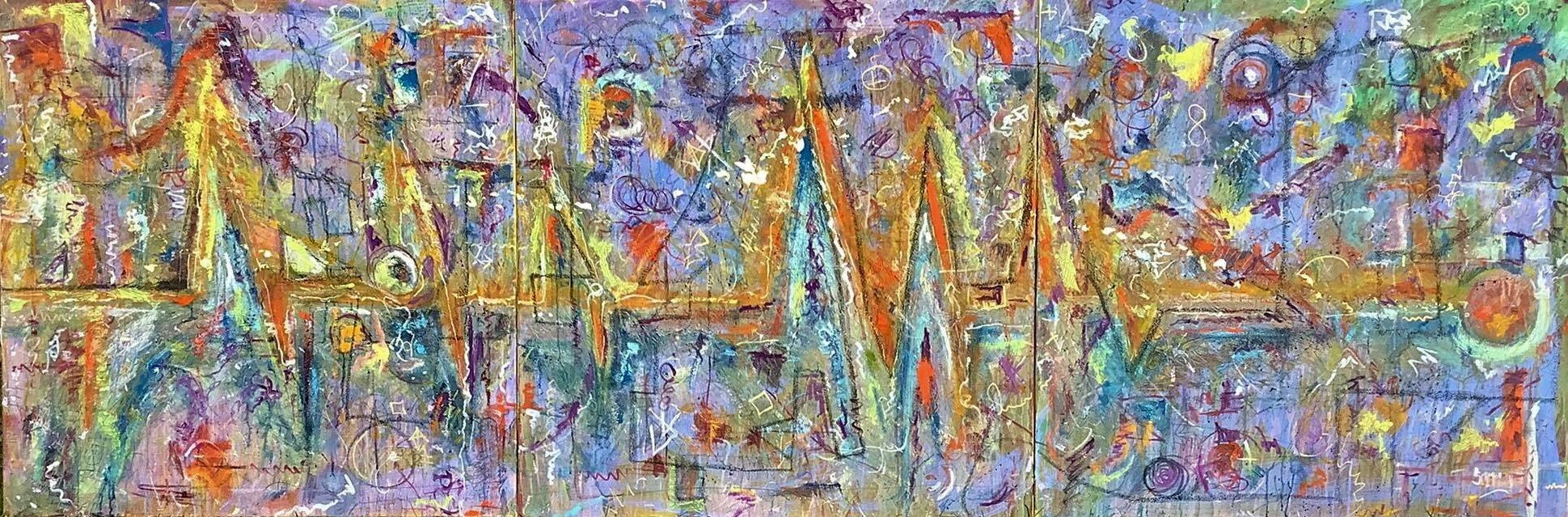
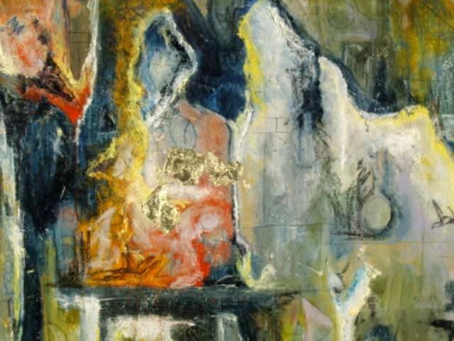
Over the past 6 years, we've been going out to Ptown on Cape Cod. Friday nights they have a gallery walk, that have featured artists on these nights. I stumbled upon 'Hilda Neily Gallery' early on and was immediately intrigued. A few years later, in 2017 a living retrospective on H. Neily & this painting, ’HEAT', was in her gallery and felt, I had found an immediate kindred spirit in her work, as she was getting back to her roots and incorperating some drip work, as well.

~Hilda Neily started painting with Henry Hensche at The Cape School in Provincetown in the early 1970's. Hensche started The Cape School in 1933, carrying on and developing the ideas of his teacher, Charles Hawthorne, who started the first art school in Provincetown. It was Hawthorne's school that led to Provincetown becoming one of America's preeminent art communities.

So then this happened, last year May 2018~ Not at her gallery but several blocks away on Macmillan Wharf, I stopped to view some student work, at a hut, of The Cape Cod School of Art. I'm asking questions about the art and the person is asking questions about Blaze(our pup) and loving on him. The conversation goes on and we're talking more about art. She starts telling me, that the school and she teaches, ”color how to see color and that once you get it, it's like dropping acid." So I tell her that I'm an admirer of Hilda Neilys work, she seems to understand that, like none other. She says, "I am Hilda Neily." I've been stopping in at her gallery over the past five years, had only seen photos of her, always painting, from the back or side profile, but never met her. Our conversation went on and on, about art, dogs and our partners. What a kick and a thrill, would love the opportunity to study with her.

With that I decided I must study with this artist, so this year, August 2019, I attended the 3 hour a day, 5 day workshop. As an artist , there’s always more to be learned & explored. It's emphasis is color and light, Hilda had me at, "once you get it, it's like dropping acid" & so we shall see. BaHaHaa😀

So, it was, I set out with this goal in mind, too learn to see the light saturated color and add it to my more tonal/colorist palette in approach paintings, thus integrating that blast of light to my work. But keep in mind that while I’ve attended some classes, studied via book & dvd, various great artists painting techniques, that it has been about 25 years since I’ve taken a class or workshop. Within my studies, which have been to learn and find what made those artists successful, not to do what they do, but perhaps incorporate some small amount of that magic into my artworks. Which is to say not immerse myself in their discipline, but utilize it within mine. The last class I took being a Remrandt style painting class at the S.A.I.C.. That would be the extreme polar opposite in approach, for various reasons, one being the palette was only 4 colors, Titanium White, Ivory Black, Venetian Red & Yellow Ochre. Teach, the instructor that is, then, was surprised at the amount of color I could express with this limited palette.

*Note 1~How I see color. I’m said to be highly color sensitive. I’ve come to see it, not as big blocks of color, but more like all the colors that are reflected within the color, that make the color, thus I’ve tended to express it broken. Ones eye tends to average it all out, at least from a distance, to an uniform color, but up close a more complex variation appears and is expressed, at least from my perspective, intent & purpose.

My Background, a partial context~ I’ve drawn and painted, been involved with the arts, the entirity of my life. Over the past 15 years have focused, prolifically on creating & exhibiting my artwork. I’m mostly self taught as I have little formal training, thus am highly experimental, in the past, however, am more refined of late. I’ve also been in the custom framing and fine art sales business, since 1986, thus am said to have a keen eye for color. If you know what slant rhyme is, I’m a slant colorist. For further info, refer to my website, about the artist, blogs or Facebooks about me.

Workshop~

Day #1- A sunny day at the Cape Cod School of Art, a class of 16-18 peeps. We set up are easels outside to do block studies, to see how color and light interact upon each other. That is to say how different colors reflect and change color, depending on the intensity of light or shadow. I set off doing what I do, how I do and had a very nice painting going, as I tend to work fast and matter-of factly. As some of the students perused each others work, some viewed mine and I heard things like, “he speaks his own language”, and I thought, cool. Then instructor came by and started working the painting, knocking down my work, in fact scrapping it off, showing and expressing why it was not correct. I was mortified, for one, I do not scrape off paint, its expensive. I tend to take pieces to their completion, if they’re not successful, I move on, but keep them around awhile as learning tools, to see what was wrong. Feeling out of sorts, at this point, I realized that the persons involved in this workshop were all at various levels of painting experience, including myself, as I’d have to unlearn, or rather try to stop doing what I do, if I were to get anything out of the experience. Although, the instructor did like some of my color notes and said so. At the end of the 3 hours, we set up our paintings in the classroom for critique. Mine stood out from the rest, for one reason or the other and not necessarily for goodones, or so I thought. Once they were set up, a woman I had not met, pointed at my work and asked who’s is that. I kept silent, then ‘C’ asked again and I replied mine. She, ‘C’, then said it looks like a HENSCHE. For review, Henry Hensche was the Cape Cod school of art instructor whu trained Hilda Neily, my current instructor. I felt a shiny lining, a ray of light, if you will.

Day #2- Began with 3 hour workshop. Overcast, grey day, H. Neily did a grey day demo. Which should have been perfect for me and yet in order to learn this way of seeing, I must abandon my artist ways, so I can then integrate this new info into my artwork, moving forward, thus challenged. Challenge one, see in blocks of color. Challenge two, I primarily use brushes and palette knife is a sublemental tool usually. Now I’m only using palette knife. Challenge three, I tend to mix color on the canvas. Challenge four, the scrape off still freaks me out. Challenge five, My panels are typically toned iron oxide, prism violet or grey, some canvas, others smooth. I’m asked too paint on white smooth boards only. My initial thought is, Great, now even the panel will reflect the light and color, but, thought, perhaps that’s intended. As Hilda states to me, “Grey board saaaad, white board HAPPY.” Adding, “the world is so messed up,” and I finishing with, “why would we want to add to that?” A most challenging day, to say the least & had to set my ego aside for the remainder of the workshop.

Day #3- We all met at a dune crest that overlooks cottages, salt marshes, the Atlantic and Ptown, off in the distance. Also, this was near where we stayed and I already had fallen in love with the view. It started as a sunshiny day. Several of her assitants, would peruse the other painters, coach and give direction. Several of them, over of this & previous days would stop by me, like what I was doing, then Hilda would come over to see what I was doing, blend or scrape off. I was working on a painting, as I’ve stated before I work quickly, so by the time Hilda got to me I had built a great many details into the painting and had what I thought a top 25%. A top 25%, is a really, really good painting. She began to blend and knock down the sky, my heart sank and my eyes bulged out of my head as my stomach flipped over, no joke. She continued, and spoke of blocks of color then stopped, stood back, partially , I think realizing, sometimes regardless of getting the light right, a good painting is a good painting. I finished knocking the colors together and removing all details. Went to see what another painter and assitant was doing. He had built up a good painting, as well. I told him I thought I had something too, he had commented as much, just 10 minutes prior. When I told him of Hilda’s reaction to it, he said, it’s best to just follow the instructors direction and perhaps the meaning would become clear. I then looked & found an opportunity to tell Hilda how I came to the workshop and showed her some of my most recent artworks, to give some context and tell her what my goal was, to see and understand the light saturated color in which she painted. The day was done and I got back to the Hotel. I had taken some photos, I had every day since the workshop began. I had taken a photo of Hilda’s and my piece that day. Eureeka, side by side in the photos we had the same color range, I had got it. While my broken color had everything there it wasn’t until they were blended, could the instructor, standing right up on it, see if I had it correct. I was thinking painting, I should have been thinking color study and realised this way of seeing and the approach is just the opposite of my regular one.

Day #4-Before I left for the workshop, I had told Don it seemed that no matter how I painted, Hilda would correct it the other direction. I felt that she was perhaps challenging me. He said, “it’s like a zen riddle, to see what you got, go with it,” and so I did. Light is a fleeting thing, to say the least. The day began as a bright shiny one and so we, set up our easels & painted from atop the dune crest this time over looking the sea. I just love the view high upon the crest where we’re staying, ironically the crest, as it turned out, is also where we’re doing the last three days of our color studies.I painted the trees in the foreground, cottages, ocean & sky. No I was painting blocks of color and was told, “yes, that’s better.” Then our sunny sky closed in, an overcast one. That means my warm & cool color variations changed and that equals a scrap off and a start over. So I scraped off and began again. More relaxed and going with the flow, I painted the scene, light included and so 1 piece completed. But was told,” to think color study not painting, find the light.” I believe Hilda’s guidance has been so beneficial and I’m so psyched to have had this opportunity to paint with her.

Day #5-The last day, was a full sunny one atop the dune crest and I stuck, strictly to color studies and finding the fleeting light. They were a great bunch of people to paint with. I walked around easel to easel, to see what others were doing. Hilda and the group huddled around her as she corrected anothers painting, explaining what she saw, as she worked. I worked the patches of color in a minalimist way akin, in my head, to Rothko. Hilda made her way to me. Are you afraid of color, she said. No look, I responded. The painting at an angle, lined up the 3 layers of the scape perfectly. I squinted down and said, If you look all the colors are spot on. “Really” she retorted, “come now.” “Are you color blind,” she playfully asked, as she began to correct my piece. “no I have a keen sense of color” I said and another painter said, “That’s another kind of color. So it was as Hilda corrected the center areas of my color study, Within each of the centers of land, sea & sky, she left the correct color notes of light.I said, yes that’s perfect and I did another study and Hilda came by again and said, yes, that’s better and I responded ,”yes, I’ve seen the light!” To which she, with a smile on her face said,” that’d be a great title for an article, I said it will be my blog.

Rarely do the stares align, but, it’s always been my mission to seek and find those artists whom I have shared ideas with & who best encapsulate the finest qualities in art and study with them. Hilda Neily is such an artist of these qualities. It has truly been both a challenging & an eye opening experience. Hilda said, “See you next year,” another assitant said to come to some of the ‘drop ins’, & ‘C’ said, “you know you’re a really good artist”. As an painter/artist I am always studying and working out a new problem, it’s the nature of painting the painting & hopefully finding the light, Hilda is such a light.

~Richard

as always your questions & comments are welcome.

1-Hilda workshop.jpg
Hilda Neily/Richard Sperry collabrative color study,(The blocks of color are me, the light in the center are Hilda, light blue in the sky, bright blue in the water & more yellow in the shrubs/trees/grasses. Exactly what I had in mind.)

Hilda Neily/Richard Sperry collabrative color study,

(The blocks of color are me, the light in the center are Hilda, light blue in the sky, bright blue in the water & more yellow in the shrubs/trees/grasses. Exactly what I had in mind.)

Art, Nature & Soul #29

On occassion I’m commissioned to do more decorative abstract artwork, as well. This piece was taylored to this collectors home with little information. That being primarily of color & size, as the client already liked and knew what I do and that’s the key. Being an artist and doing commissions, can be tricky because it’s a meeting of the minds, both collector and artist merged.

At 60”x15” and horizontal the important part for me was giving it a focal spot. This was achieved by using silver leaf and stronger color at the center and tapering off as the piece expanded the depths of the horizon. The rest was basic design elements: color, line, texture, shape, space & so on. Beyond my typical approach, which begins with a three color acrylic splash painting, followed by laying in the my oils, increasingly, I began to utilize a ‘Scraffito’ technique to scratch into previous layers of color, thus giving more line, direction & texture, plus adding in 18k gold or silver leaf as I’ve done in this work.

The piece then completed, sent an image off to the customer for their approval and was framed in a simple black gallery frame, delivered & hung to their delight.

Commissions welcome & as always feel free to comment or ask questions

~Richard

commissioned artwork in its home

commissioned artwork in its home

1-P5068077.JPG

Art, Nature & Soul #28

One fall the 3rd week of October, some 15 years ago, Don, myself and three of our pups, loaded up in our Dodge Grand Caravan and headed for Mount Desert Island (MDI) Maine. On a road trip you can take in the colors of fall and they were particularly vibrant this year as we drove from Illinois to Maine observing the different trees and colors of the states. We arrived in the coastal town of Bar Harbor on MDI and ”it’s so beautiful”, that’s right beautiful & I continued to say that more times than ever before over our week stay. It was solidly 55-75 degrees & perfect walking weather.

New England has always been of fascination to me. I had family out east when I was growing up. The ocean, its old world charm and history had me hooked from the beginning. Everywhere on MDI was yet another picuresque and paintable vista around every turn and so was the inspiration for this piece. A nested harbor for the lobster man of Maine. Egg Rock Light is in the distance as gulls and sea birds circle around in search of food, flanked by spits of land & coastal pines. It’s a cool day and the waters are choppy, but perfect for the fisherman as the boats come and go in search of their catch of the day. A seagull sits sentry upon the scene as the men on the docks pull up cages, small boat, still another sits fishing while a lobster scurries loose on the pier unbeknowst to all but the pup, Kai-Guy, our oldest & first Shiba Inu, knows its there and wants to play.

Its lasting impression survives in this and other such images I created and painted of the area. Where , the sea beckons me, people still make there living fishing, & lobster is served every which you can, even as fast food.

As always feel free to comment. ~Richard

Rock Lobster, 30”x24” oil (2008) NFS

46758564_10210596720473311_1936674605729054720_n.jpg

Art, Nature & Soul #27

Commissions Welcome! While it would be great if everything one painted sold, it’s not the case. The truth is, if you’re a more prolific artist, you produce a lot of art. The majority of it is good, some superior and fewer pieces, are just experiments that went askew . That said, the market is satuarated with art, artists and painters trying to sell their work, especially in recent history. It seems a great many people are trying to find a more balanced lifestyle, thus, creating fills the need, that’s great and I encourage that whole heartedly. I’ve often thought about holding & teaching an art expression/therapy group. I still may, in the near future.

That said, commissioned artwork is yet another avenue of services, that I offer, as painter. From abstract to portraits and everywhere in between, even bookcovers, have been some of the requests I’ve honored upon commission. It can be more of a challenge to paint commissioned piece, as it’s, in part bridging a clients vision to mine. Although most clients know what I do and their expectations correlate to them from the start. I’ve been doing commissioned work since I was a young teenager. Some of them commercial business signs, still others pastel portraits, & even stained glass windows, are some works I’ve accomplished upon request .

This piece was commissioned by a person who had a particular vision. She lives here in the midwest & winters on the Georgia coast. The beach, ocean, & it’s abundant life, plus it’s calming effect have a great appeal to her. The sandpipers scurry and feed along the shoreline. It was with a certain color pallette and look, intended that this piece was executed and delivered to another happy collector.

as always, Your questions & comments are welcome

~Richard

‘Shoreline Beachcombers’ 24”x20” oil on canvas (Commissioned 2018)

31144285_10209323753689937_1466798423268130816_n.jpg